library(RwR)
library(ggplot2)
library(tibble)
library(broom)
library(splines)
library(dplyr)
library(glmnet)10 Small for gestational age – a case study
Important
This chapter is still under development and certain parts are still a bit rough. Notable changes will be made without notice, but the core structure of the chapter and the analyses and code are in place.
This chapter is a continuation of the case study on birth weight in Chapter 3. In that chapter the focus is on models of the expected birth weight. In this chapter the focus is on models of quantiles and more extreme cases, and on regression models with a binary response. Specifically, we will develop a model of a binary variable that we construct from the data and call small for gestational age. It will represent cases where the birth weight is relatively extreme among births for the same gestational age.
The construction of the binary variable will, in itself, be an instructive application of regression modeling of a quantile in a conditional distribution. Subsequently, we will use the constructed binary variable as our reponse and demonstrate various regression modeling techniques for binary reponses using the framework of generalized linear models. One of these, the logistic regression model, deserves special attention, since it is both the historical antecedent of generalized linear models and the most widely applied generalized linear model.
10.1 Outline and prerequisites
In Section 10.2 we revisit the regression modeling of birth weight with only gestational age as predictor. We develop several different models of the quantiles in the conditional distributions of birth weight given gestational age. We are particularly interested in the conditional 10% quantile, and based on one such model we define the variable small for gestational age as the indicator that birth weight is smaller than the 10% quantile. In Section 10.3 we cover a number of binary regression models, most notably logistic regression. The section covers both standard applications of the general theory and methodology for generalized linear models to this particular response distribution, and it covers some specific methods for binary responses, in particular in terms of measuring predictive performance and special model diagnostic tools such as calibration plots.
The chapter primarily relies on the following R packages.
10.2 Small for gestational age
We first load the data from the RwR package and clean data as in Chapter 3.
Code
data(birth_weight, package = "RwR")
birth_weight <- filter(
  birth_weight,
  weight > 32,
  length > 10 & length < 99,
  gestationalAge > 18
) |>
  na.omit() |>
  select(- c(interviewWeek, fetalDeath))
We then revisit the weight as a function of gestational age, see also Figure 3.7. We are now less interested in the mean or median weight but rather in the quantiles, specifically the lower quantiles of the distribution of weight as a function of gestational age. We compute a range of empirical quantiles stratified according to gestational age.
Code
weight_quant <-
    group_by(birth_weight, gestationalAge) |>
    summarize(
        q05 = quantile(weight, 0.05),
        q10 = quantile(weight, 0.1),
        q50 = quantile(weight, 0.5),
        q90 = quantile(weight, 0.9),
        q95 = quantile(weight, 0.95)
    )
Code
p_box <- ggplot(birth_weight, aes(x = as.factor(gestationalAge), y = weight)) +
  geom_boxplot(fill = gray(0.8), color = gray(0.5), alpha = 0.4, outlier.alpha = 0.1) + xlab("Gestational age")
p_box +
    geom_line(data = weight_quant, aes(y = q05, group = 1), color = "red") +
    geom_line(data = weight_quant, aes(y = q10, group = 1), color = "blue") +
    geom_line(data = weight_quant, aes(y = q50, group = 1), color = "purple") +
    geom_line(data = weight_quant, aes(y = q90, group = 1), color = "blue") +
geom_line(data = weight_quant, aes(y = q95, group = 1), color = "red") 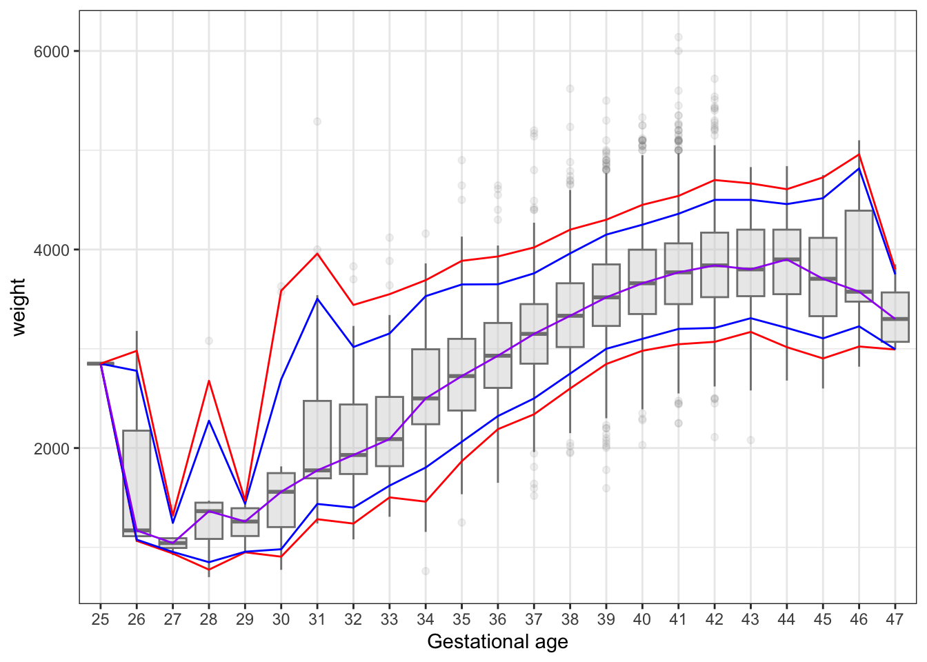
It is clear from Figure 10.1 that the empirical quantiles are rather poorly determined for early and late births – dues of the smaller number of cases. We therefore turn to a spline based regression model of the conditional mean, and then based on the model we can compute quantiles using two different methods. Either as if the residuals were normally distributed, or by computing the empirical quantiles1 for the distribution of the residuals.
1 This then avoids assuming that the residuals follow a normal distribution, but it does assume that the residual distribution, or at least the relevant quantile, is independent of the predictors. This is a slightly stronger assumption that A2.
Code
nsg <- function(x) ns(x, knots = c(30, 35, 38, 40, 42, 45), Boundary.knots = c(25, 47))
small_lm_nsg <- lm(weight ~ nsg(gestationalAge), data = birth_weight)
df_res <- glance(small_lm_nsg)$df.residual
res <- residuals(small_lm_nsg)
sigma_hat <- (res^2 |> sum() / df_res) |> sqrt()

weight_quant <- mutate(
    weight_quant,
    q50_norm = predict(small_lm_nsg, newdata = weight_quant),
    q05_norm = q50_norm + sigma_hat * qnorm(0.05),
    q10_norm = q50_norm + sigma_hat * qnorm(0.10),
    q90_norm = q50_norm + sigma_hat * qnorm(0.90),
    q95_norm = q50_norm + sigma_hat * qnorm(0.95),
    q05_emp = q50_norm + quantile(res, 0.05),
    q10_emp = q50_norm + quantile(res, 0.10),
    q90_emp = q50_norm + quantile(res, 0.90),
    q95_emp = q50_norm + quantile(res, 0.95)
)
Code
p1 <- ggplot(weight_quant, aes(gestationalAge)) +
    geom_line(aes(y = q05_norm), color = "red", linetype = 2) +
    geom_line(aes(y = q10_norm), color = "blue", linetype = 2) +
    geom_line(aes(y = q50_norm), color = "purple", linetype = 2) +
    geom_line(aes(y = q90_norm), color = "blue", linetype = 2) +
    geom_line(aes(y = q95_norm), color = "red", linetype = 2) +
    geom_line(aes(y = q05), color = "red") +
    geom_line(aes(y = q10), color = "blue") +
    geom_line(aes(y = q50), color = "purple") +
    geom_line(aes(y = q90), color = "blue") +
    geom_line(aes(y = q95), color = "red") +
    ylab("weight") + ylim(0, 5000) +
    ggtitle("A")

p2 <- ggplot(weight_quant, aes(gestationalAge)) +
    geom_line(aes(y = q05_norm), color = "red", linetype = 2) +
    geom_line(aes(y = q10_norm), color = "blue", linetype = 2) +
    geom_line(aes(y = q50_norm), color = "purple", linetype = 2) +
    geom_line(aes(y = q90_norm), color = "blue", linetype = 2) +
    geom_line(aes(y = q95_norm), color = "red", linetype = 2) +
    geom_line(aes(y = q05_emp), color = "red") +
    geom_line(aes(y = q10_emp), color = "blue") +
    geom_line(aes(y = q90_emp), color = "blue") +
    geom_line(aes(y = q95_emp), color = "red") +
    ylab("weight") + ylim(0, 5000) +
    ggtitle("B")

gridExtra::grid.arrange(p1, p2, ncol = 2)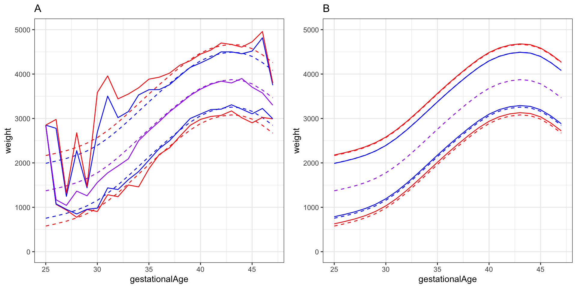
There are several other possibilities for computing an estimate of the lower decile (the 10% quantile), say, than the three methods presented above. We mention a couple here.
- Quantile regression via the check-loss.
- Spline expansions with optimized smoothness, e.g., via
smooth.spline().
Based on the regression model of the mean weight conditionally on the gestational age and the empirical distribution of the residuals, we construct a binary variable we call small, and which is an indicator of whether the child’s weight is below the 10% quantile for the gestational age. The variable is thus indicating that the child is small for gestational age.
Code
birth_weight <- mutate(
    birth_weight,
    q10 = predict(small_lm_nsg) + quantile(res, 0.10),
    small = as.numeric(weight < q10)
)
10.3 Binary regression
When the reponse variable can only take two possible values we refer to a corresponding regression model as a binary regression model. Usually we encode the two possible outcomes of a binary response variable as \(0\) (zero) and \(1\) (one)2. This is convenient since for \(Y \in \{0, 1\}\) it holds that the (conditional) probability that \(Y = 1\) given \(X = x\) can be written as \[ p(x) = P(Y = 1 \mid X = x) = E(Y \mid X = x). \] Thus \(p(x)\) is the regression function, and we usually denote it by \(p(x)\) rather than using the general notation \(m(x)\). This is to indicate that \(p(x)\) is a probability.
2 It is also common to encode the binary outcomes as \(\pm 1\). If the two outcomes represent asymmetric numerical values, e.g., a gain and loss in a game, we can also consider using that encoding.
In the remaining part of this chapter, the response variable will be the binary indicator small that was constructed in the section above. The following two questions will drive our analysis:
- How strong is the association between the two lifestyle factors
coffeeandsmokingand the indicatorsmall? - How good a predictive model of
smallcan we fit to the data?
Seeking answers to these two questions will get us around many aspects of modeling a binary response variable using a regression model.
We note that we will not redo any exploratory data analysis in this chapter. All the predictor variables in the dataset are the same as in Chapter 3 and we refer to that chapter for an exploratory analysis of the distributions of the predictors.
10.3.1 Logistic regression
We will use all variables in the dataset except weight, length and gestationalAge as predictors of the indicator variable small. The first model we fit is a logistic regression model with all variables entering additively and with the numerical variables age, alchohol and feverEpisodes entering linearly (on the link scale). The logistic regression model is the model with a binomial response distribution and logit link function (the canonical link for the binomial model).
Code
form <- small ~ age + children + coffee + alcohol +
    smoking + abortions + feverEpisodes
small_glm <- glm(form, data = birth_weight, family = "binomial")
We then consider various model diagnostic plots to investigate if the logistic regression model fits the data. Figure 10.3 shows four plots based on the Pearson residuals. Three plots show the residuals against the fitted values and two of the numerical predictors, and they do not suggest any problems with the mean value specification. In all three plots the smoothed curve falls closely around zero, which indicates that the residuals approximately have mean zero.
Code
small_glm_aug <- augment(small_glm, type.residuals = "pearson") |>
    mutate(.fitted_group = cut(.fitted, quantile(.fitted, probs = seq(5, 95, 1) / 100)))

p1 <- small_glm_aug |>
    ggplot(aes(.fitted, .resid)) +
    geom_point() +
    geom_smooth() +
    xlab("fitted values") +
    ylab("Pearson residuals")

p2 <- small_glm_aug |>
    ggplot(aes(age, .resid)) +
    geom_point() +
    geom_smooth() +
    ylab("Pearson residuals")

p3 <- small_glm_aug |>
    ggplot(aes(feverEpisodes, .resid)) +
    geom_point() +
    geom_smooth(method = "lm") +
    ylab("Pearson residuals")

p4 <- small_glm_aug |>
    group_by(.fitted_group) |>
    summarize(.fitted_local = mean(.fitted), .var_local = var(.resid)) |>
    na.omit() |>
    ggplot(aes(.fitted_local, .var_local)) +
    geom_point() +
    geom_hline(yintercept = 1, linetype = 2) +
    geom_smooth() +
    xlab("fitted values") +
    ylab("variance")

gridExtra::grid.arrange(p1, p2, p3, p4, ncol = 4)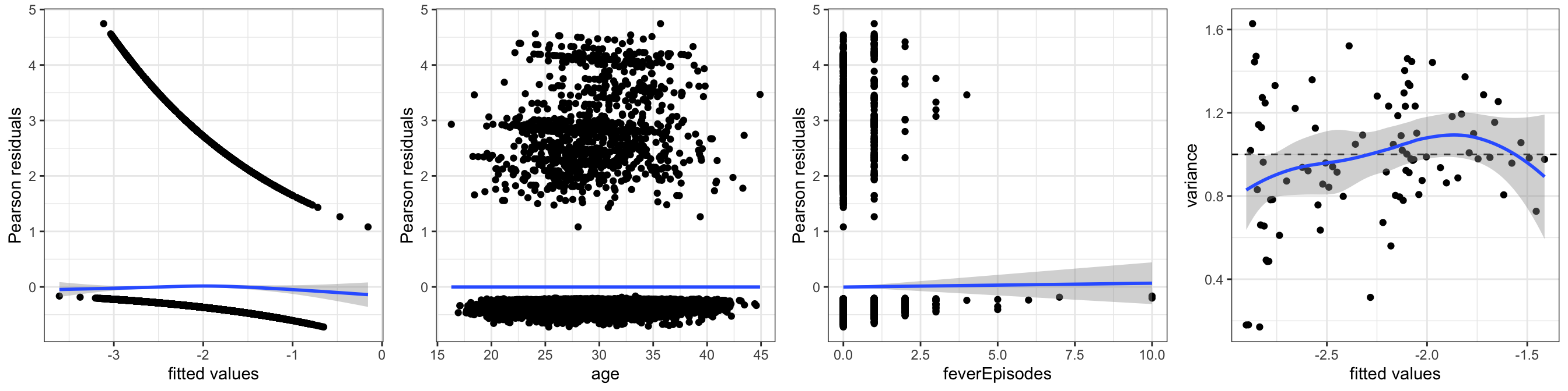
age and feverEpisodes. The rightmost plot shows local estimates of residual variance against fitted values.
What about the variance function and the dispersion parameter? Note first that since the response is binary, its (conditional) distribution is completely determined by \(p(x)\) and its (conditional) variance equals \[ V(Y \mid X = x) = p(x) (1 - p(x)). \] Thus if the mean value model is correctly specified, the variance function for the binomial model, \[ \mathcal{V}(\mu) = \mu (1 - \mu), \] is automatically correct, and the dispersion parameter equals \(\psi = 1\). For binary response variables there is no such phenomenon as “overdispersion” – but the mean value model can still be misspecified, which will then also lead to a misspecification of the variance.
To assess the variance specification, the rightmost plot in Figure 10.3 is constructed by locally estimating the variance of the Pearson residuals for groups of observations with similar fitted values. The plot shows that these variances all fall around one and there is no systematic dependence on the fitted values. Thus there is no indication of a model misspecification in terms of the variance either. Following the arguments above, this is not an independent assessment of whether the variance function is correct. It is rather a supplementary assessment of whether the mean value model is correct.
Code
drop1(small_glm, test = "LRT") |>
  tidy() |>
  arrange(p.value, desc(LRT)) |>
  filter(term != "<none>") |>
  select(-AIC) |>
knitr::kable()| term | df | deviance | LRT | p.value |
|---|---|---|---|---|
| children | 1 | 7272.055 | 116.6599396 | 0.0000000 |
| smoking | 2 | 7217.226 | 61.8307777 | 0.0000000 |
| coffee | 2 | 7179.761 | 24.3657268 | 0.0000051 |
| abortions | 3 | 7161.458 | 6.0635546 | 0.1085588 |
| alcohol | 1 | 7157.879 | 2.4845804 | 0.1149670 |
| feverEpisodes | 1 | 7156.725 | 1.3299671 | 0.2488111 |
| age | 1 | 7156.042 | 0.6475796 | 0.4209794 |
To assess the significance of the included predictors, Table 10.1 shows the results from testing the parallel hypotheses where each variable is dropped from the model while all others remain in the model. The tests are based on the deviance test statistic, see Definition 6.2, and the \(p\)-values are computed using a \(\chi^2\)-approximation. We see from the table that the three predictors children, smoking and coffee cannot be removed from the model, while neither of the hypotheses for the remaining four variables can be rejected.
We refit the model below with a reordering of the variables according to their \(p\)-values in Table 10.1. This does not change the model but results in a more useful ordering of the output in various cases.
Code
form <- small ~ children + smoking + coffee + alcohol +
     + abortions + feverEpisodes + age
small_glm <- glm(form, data = birth_weight, family = "binomial")
Code
tidy(small_glm)[-1, "estimate"] |>
    cbind(confint.lm(small_glm)[-1, ]) |>
knitr::kable(digits = 2)| estimate | 2.5 % | 97.5 % | |
|---|---|---|---|
| children1 | -0.74 | -0.88 | -0.61 |
| smoking2 | 0.45 | 0.29 | 0.62 |
| smoking3 | 0.64 | 0.46 | 0.81 |
| coffee2 | 0.28 | 0.14 | 0.42 |
| coffee3 | 0.62 | 0.32 | 0.93 |
| alcohol | 0.05 | -0.01 | 0.11 |
| abortions1 | -0.09 | -0.27 | 0.10 |
| abortions2 | -0.24 | -0.64 | 0.15 |
| abortions3 | 0.54 | 0.01 | 1.07 |
| feverEpisodes | -0.08 | -0.22 | 0.06 |
| age | 0.01 | -0.01 | 0.02 |
Table 10.2 shows standard \(0.95\)-confidence intervals for all parameters in the model. We note that these are generally in corcordance with the conclusions from the tests above. That is, for they do not contain \(0\) for any of the parameters related to the variables children, smoking and coffee, while they do contain \(0\) for the remaining variables – except abortions3 where the interval just misses \(0\) to the left.
What is perhaps more important is that Table 10.2 allows us to read of the signs and magnitudes of the associations. For the two variables we are primarily interested in, smoking and coffee, we see that the corresponding parameters are all positive. This means that compared to the baseline groups (not smoking and not drinking coffee) there is a higher risk that the child is small for gestational age if the mother smokes or drinks coffee. There is even an monotone relation because the parameters for groups smoking3 and coffee3 are larger than for smoking2 and coffee2. The magnitudes of the associations are about the same for both variables.
Contrary to smoking and coffee, the variable children is negatively associated with the reponse, which means that if the mother had children before, there is a lower risk that the child will be small for gestational age.
It is notoriously difficult to interpret the magnitudes of the parameter estimates correctly in a logistic regression analysis. The parameters are log-odds-ratios, which mean that their exponentials are odds-ratios. If we take an estimate like \(\hat{\beta}_{\texttt{smoking2}} = 0.45\) and exponentiate it we get \(e^{0.45} = 1.56\). Now suppose that the risk for a mother that does not smoke is \(p\), then if the
smoking status were \(2\) instead, the probability would change to \(\tilde{p}\) satisfying \[
\frac{\tilde{p}}{1 - \tilde{p}} = 1.56 \cdot \frac{p}{1 - p}.
\] We can rewrite this relation as \[
\tilde{p} = \frac{1.56 \cdot p}{1 - (1 - 1.56) \cdot p} = \frac{1.56 \cdot p}{1 + 0.56 \cdot p}.
\] If \(p\) is small, the odds-ratio is roughly equal to the risk ratio (\(\tilde{p} / p\)). If \(p = 0.1\), say, then \(\tilde{p} = 0.1477\), which is roughly a factor \(1.56\) larger than \(p\) but not quite.
If we now compare a mother that neither smokes nor drinks coffee to one with both smoking and coffee status 3 (all other variables being equal) then the estimated odds-ratio equals \(e^{0.64 + 0.62} = 3.53\) and the formula for \(\tilde{p}\) becomes \[ \tilde{p} = \frac{3.53 \cdot p}{1 + 2.53 \cdot p}. \] This changes \(p = 0.1\) to \(\tilde{p} = 0.28\) and is a notable increase of the risk. It is not quite a factor \(3.5\) but still about a factor \(3\).
Mothers that had children before has, on the other hand, a smaller risk of having a small child compared to first-time mothers. The odds-ratio is \((e^{-0.74} = 0.4771)\), and the risk is thus reduced by roughly a factor \(0.5\) (for small probabilities).
10.3.2 Other binary regression models
The logistic regression model makes a specific choice about the link function. Setting the argument family = "binomial" when calling glm() specifies implicitly that the link function is the canonical link for the binomial distribution. That is, the link function is the \(\mathrm{logit}\) function. There are a couple of standard alternative link functions used with the binomial model
\[ \begin{align*} \mathrm{logit}(p) & = \log \frac{p}{1-p} \\ \mathrm{probit}(p) & = \Phi^{-1}(p) \\ \mathrm{cloglog}(p) & = \log(-\log(1 - p)) \end{align*} \]
Here \(\Phi\) denotes the distribution function for the standard normal distribution, and the \(\mathrm{cloglog}\) function is known as the complementary log-log link. The corresponding mean value functions are
\[ \begin{align*} \mu(\eta) & = \frac{e^\eta}{1 + e^\eta} \qquad \ \ (\mathrm{logit}) \\ \mu(\eta) & = \Phi(\eta) \qquad \quad \ \ (\mathrm{probit}) \\ \mu(\eta) & = 1 - e^{-e^\eta} \qquad (\mathrm{cloglog}). \end{align*} \] These three mean value functions are also distribution functions3, and one could, in principle, use any distribution function as a mean value function. The logit and cloglog links are particularly convenient because the link function and its inverse have simple analytic expressions. We note that when \(p\) is small, the logit and cloglog links are very similar, and both behave like the logarithm, which we also consider below as a possible link function.
3 The distribution function corresponding to the \(\mathrm{cloglog}\) link is a Gumbel distribution reflected at \(0\).
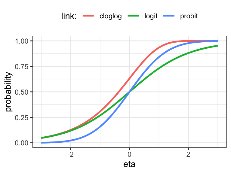
The logarithm and the identity are occasionally also used as link functions. They do not map \(\mathbb{R}\) into \((0, 1)\), which can lead to various issues – both numerical issues and issues with interpretations and applications. But they may sometimes be better choices if the effects of the predictors are better captured this way. If we want to use the identity link, we can consider using lm() instead of glm(family = binomial(link = "identity")). The former will fit the model using least squares (and will ignore if probabilities are estimated to be negative or greater than one). The latter will fit the model using IWLS based on the variance function \(\mathcal{V}(p) = p(1 - p)\), and it will result in an error if the estimated probabilities fall outside of \((0, 1)\).
In addition to the logistic regression model above, we fit four models for different link functions. Note that for fitting the model with the identity link we use lm(), which thus uses a misspecified variance function. However, it can potentially still fit a sensible mean value model, but since Assumption A2 does not hold, we should not trust results that hinge on this assumption, e.g., standard errors and \(p\)-values.
Code
small_glm_prob <- glm(
    form,
    data = birth_weight,
    family = binomial(link = "probit")
)
small_glm_cloglog <- glm(
    form,
    data = birth_weight,
    family = binomial(link = "cloglog")
)
small_glm_log <- glm(
    form,
    data = birth_weight,
    family = binomial(link = "log")
)
small_lm <- lm(form, data = birth_weight)
Code
tidy(small_glm_prob)[-1, "estimate"] |>
    cbind(confint.lm(small_glm_prob)[-1, ]) |>
knitr::kable(digits = 2)| estimate | 2.5 % | 97.5 % | |
|---|---|---|---|
| children1 | -0.39 | -0.46 | -0.32 |
| smoking2 | 0.24 | 0.16 | 0.33 |
| smoking3 | 0.35 | 0.25 | 0.44 |
| coffee2 | 0.14 | 0.07 | 0.22 |
| coffee3 | 0.33 | 0.16 | 0.50 |
| alcohol | 0.02 | -0.01 | 0.06 |
| abortions1 | -0.04 | -0.13 | 0.06 |
| abortions2 | -0.13 | -0.33 | 0.07 |
| abortions3 | 0.29 | 0.00 | 0.58 |
| feverEpisodes | -0.04 | -0.11 | 0.03 |
| age | 0.00 | 0.00 | 0.01 |
Table 10.3 shows the estimates and standard \(0.95\)-confidence intervals for the model using the probit link. We observe that the numerical values of the parameter estimates are different from those in Table 10.2, but the signs and magnitudes as well as the statistical conclusions we can draw from the confidence intervals are the same as for the logistic regression model. The picture is similar for the other models, though the parameter estimates are somewhat different for the identity link.
The interpretation of the magnitudes of the parameter estimates on these alternative link scales can be even more challenging than on the logit scale. For the probit scale there is no clear intepretation, but if we use the log link the parameters are log-relative-risks. As for the logit link, the complementary log-log link also behaves like the log link for small probabilities, in which case the parameters are also approximately log-relative-risks. If we use the identity link, the parameter directly represent additive changes of the probabilities.
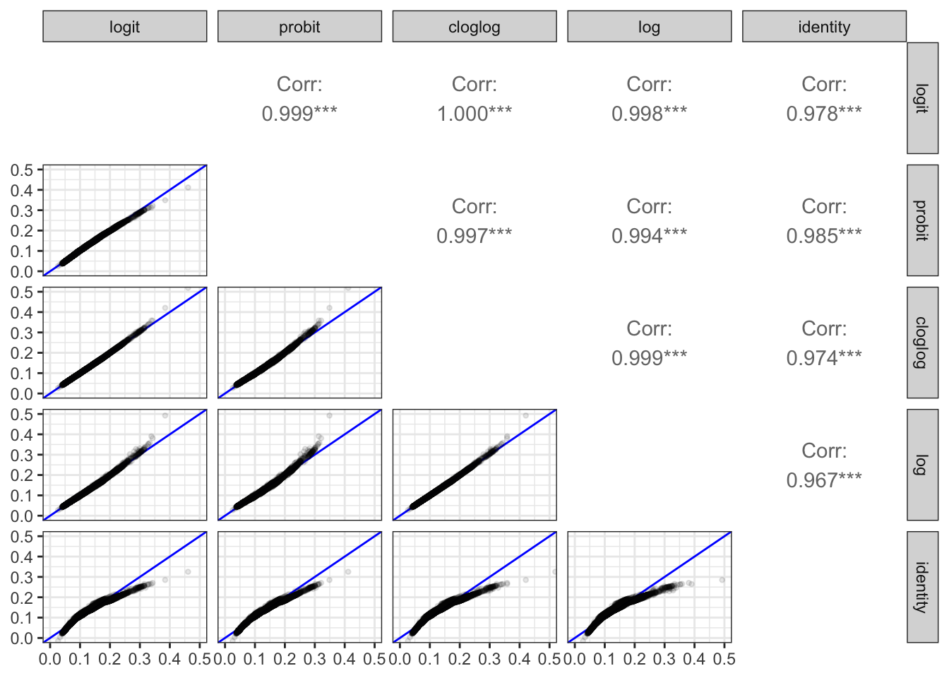
To get a better idea about how much the fitted models differ for different choices of link function, we plot the fitted probabilities from all models against each other. Figure 10.5 shows the resulting scatter plot matrix. We observe that most points fall close to the diagonal all models aggree to a very large extent on the fitted probabilities. This is also reflected by the correlations between the fitted probabilities that are all very close to one. The only model that differs a bit from the others is the one using the identity link. Compared to the other models it overestimates both the large and the small probabilities.
Code
comp_fit <- function(data, mapping, ...) {
    ggplot(data, mapping, ...) +
        geom_abline(slope = 1, intercept = 0, color = "blue") +
        geom_point(..., alpha = 0.1, pch = 20) +
        coord_cartesian(xlim = c(0, 0.5), ylim = c(0, 0.5))
}

tibble(
    logit = fitted(small_glm),
    probit = fitted(small_glm_prob),
    cloglog = fitted(small_glm_cloglog),
    log = fitted(small_glm_log),
    identity = fitted(small_lm)
) |>
    GGally::ggpairs(
        lower = list(continuous = comp_fit),
        diag = list(continuous = "blankDiag")
    )
lm().
In conclusion, the different choices of link function have limited influence on the probabilities that the models predict, though it will affect how the models are parametrized and the interpretations of the magnitudes of the individual parameters.
10.3.3 Calibration
When we make probabilistic predictions, a central question is whether events we predict to have probability \(p\) also happen with (roughly) probability \(p\). We say that the predictions are well calibrated if that is true. For a binary regression model this means that \(Y = 1\) happens in about \(p(x)\) of the cases where \(X = x\).
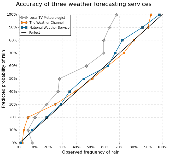
Figure 10.6 shows a plot of predicted probabilities of rain against observed probabilities for three different kinds of weather forecasting service. We see that on local TV the risk of rain is exaggerated for most of the scale of actual probabilities. The Weather Channel exaggerates the risk when the probabilities are small. For example, when they report a 20% risk of rain, it actually only rains in about 5% of the cases. However, from 30% and up, the The Weather Channel’s predictions are well calibrated, and The National Weather Service makes well calibrated probabilistic predictions on the entire scale.
It is not obvious how to produce a calibration plot for a regression model, since we typically have at most one observation with exactly \(X = x\) for any particular \(x\). The standard technique is therefore to group together observations that have about the same predicted probability and then compute the relative frequency of the outcome \(Y = 1\) within each group. We can then make a calibration plot where we plot these observed probabilities against the predicted probabilities. The points should fall roughly on the diagonal for the predictions to be well calibrated. Figure 10.6 is flipped compared to how calibration plots are usually made.
To construct a calibration plot we first implement a small function for computing the predicted and observed probabilities based on a model. The function includes the computation of standard errors on the observed probabilities, reflecting the number of observations in each group.
Code
group_p <- function(y, p, n_probs = 100) {
    qt <- quantile(p, probs = seq(0, n_probs, 1) / n_probs)
    tibble(
        y = y,
        p = p,
        p_group = cut(p, qt, include.lowest = TRUE)
        ) |>
        group_by(p_group) |>
        summarize(
            p_local = mean(p),
            obs_local = mean(y),
            se_local = sqrt(p_local * (1 - p_local) / n()),
        )
}
We then implement the generic ggplot code for making the calibration plot.
Code
cal_plot <- ggplot(mapping = aes(p_local, obs_local)) +
    geom_ribbon(aes(
        ymin = p_local - 1.96 * se_local,
        ymax = p_local + 1.96 * se_local
    ), fill = "orange", alpha = 0.1) +
    geom_point() +
    geom_abline(slope = 1, intercept = 0, linetype = 2, color = "orange") +
    geom_smooth() +
    xlab("predicted probability") +
    ylab("observed probability")
Code
gridExtra::grid.arrange(
    cal_plot %+% group_p(birth_weight$small, fitted(small_glm), n_probs = 50) +
        coord_cartesian(xlim = c(0, 0.35), ylim = c(0, 0.35)),
    cal_plot %+% group_p(birth_weight$small, fitted(small_glm), n_probs = 100) +
        coord_cartesian(xlim = c(0, 0.35), ylim = c(0, 0.35)),
    ncol = 2
) 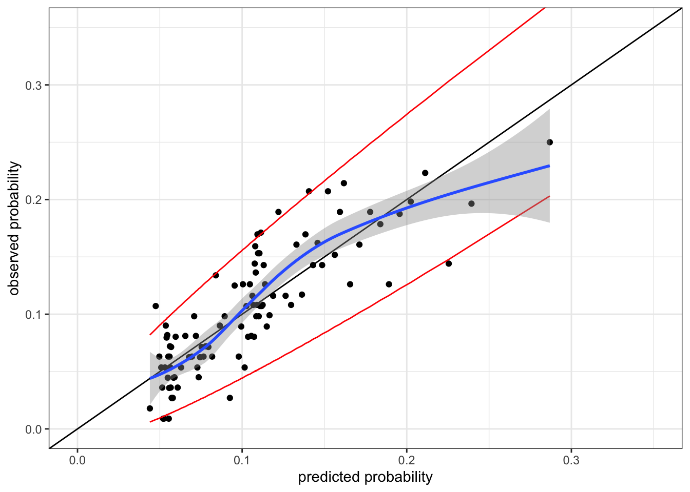
Figure 10.7 shows the calibration plot for the logistic regression model. The predictions are not poorly calibrated, but they are not perfect either. The predicted probabilities slightly underpredicts the observed probabilities in the range between 0.1 and 0.2.
One way to potentially improve the model is to include interactions. The model below includes all first order interactions among all variables.
Code
form_int <- small ~ (age + children + coffee + alcohol +
    smoking + abortions + feverEpisodes)^2
small_glm_int <- glm(form_int, data = birth_weight, family = "binomial")
Code
cal_plot %+% group_p(birth_weight$small, fitted(small_glm_int)) +
coord_cartesian(xlim = c(0, 0.35), ylim = c(0, 0.35)) 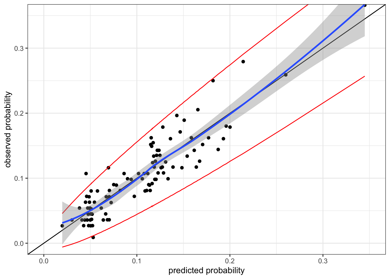
The calibration plot for the interaction model, Figure 10.8, shows that the interaction model appears well calibrated. But there is a caveat here. The interaction model is a more complex model, and the model is fitted by maximizing the likelihood, which is an attempt to make the model well calibrated. Thus we should expect a more complex model to appear better calibrated on the training data than a less complex one – just as the training error underestimates the generalization error for a complex model.
The solution is to the optimism of the calibration plot on training data is again to use data splitting. Here we implement a simple \(K\)-fold cross-validation procedure with just \(K\) rounds. It returns the predicted values on the probability scale.
Code
cv <- function(form, data, K = 10) {
    n <- nrow(data)
    response <- all.vars(form)[1]
    mu_hat <- numeric(n)
    group <- sample(rep(1:K, length.out = n))
    for(i in 1:K) {
        model <- glm(form, data = data[group != i, ], family = "binomial")
        mu_hat[group == i] <-
                predict(model, newdata = data[group == i, ], type = "response")
    }
    mu_hat
}
Code
p1 <- cal_plot %+% group_p(birth_weight$small, cv(form, birth_weight)) +
    coord_cartesian(xlim = c(0, 0.35), ylim = c(0, 0.35)) + ggtitle("Additive model")
p2 <- cal_plot %+% group_p(birth_weight$small, cv(form_int, birth_weight)) +
    coord_cartesian(xlim = c(0, 0.35), ylim = c(0, 0.35)) + ggtitle("Interaction model")
gridExtra::grid.arrange(p1, p2, ncol = 2)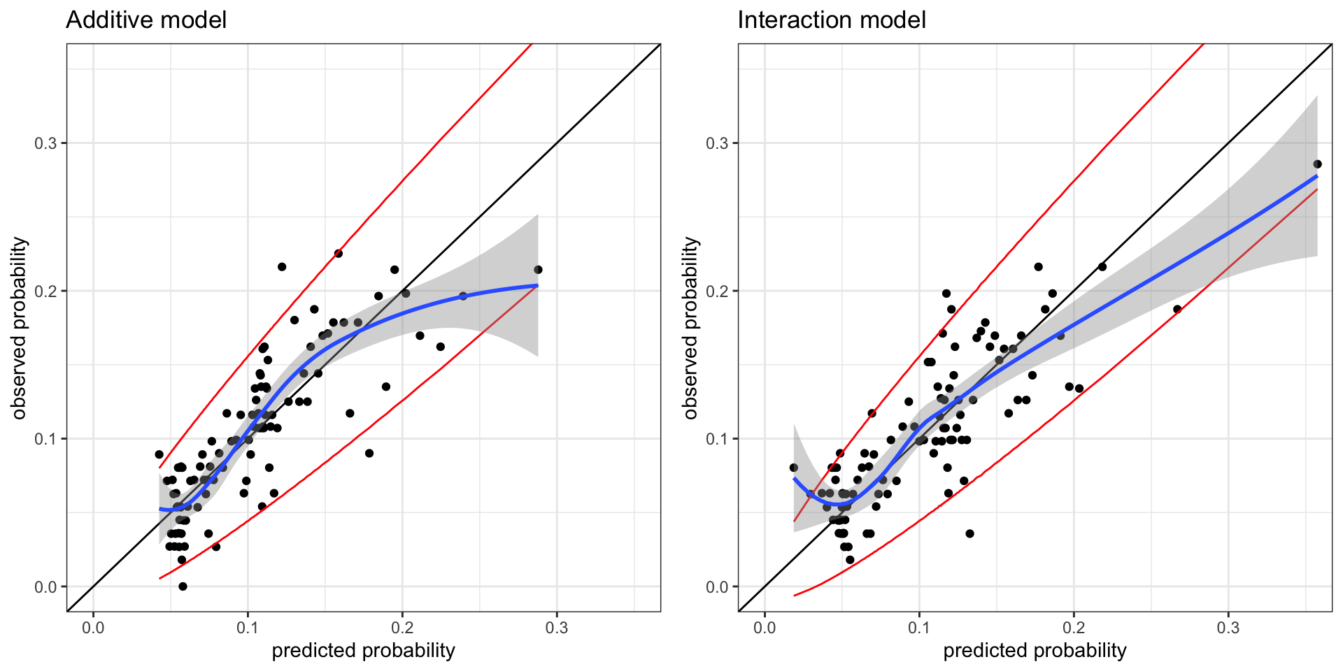
Figure 10.9 does not change our perspective on the calibration of the additive model (without interaction terms). The cross-validated calibration plot for that model resembles Figure 10.7. The cross-validated calibration plot for the interaction model in Figure 10.9 is, however, not as convincing as Figure 10.8. It seems that the interaction model underpredicts the small probabilities and overpredicts the large probabilities. There are random fluctuations in the plot due to the random splits in the cross-validation procedure, but repeated runs result in calibration plots with similar overall structure.
10.3.4 Measuring and optimizing predictive performance
In this section we investigate if the interaction model actually gives better predictions than the additive model. Before doing that, we will also formerly test the interaction model against the additive model using the deviance test statistic.
Code
anova(
    small_glm,
    small_glm_int,
    test = "LRT"
) |> knitr::kable()| Resid. Df | Resid. Dev | Df | Deviance | Pr(>Chi) |
|---|---|---|---|---|
| 11140 | 7155.395 | NA | NA | NA |
| 11090 | 7071.212 | 50 | 84.18327 | 0.0017745 |
Table 10.4 shows that we can reject the hypothesis of the additive model. Thus there is evidence for some interactions. Table 10.5 shows which of the different terms are significant.
Code
drop1(small_glm_int, test = "LRT") |>
  tidy() |>
  arrange(p.value, desc(LRT)) |>
  filter(term != "<none>") |>
  select(-c(deviance, AIC)) |>
knitr::kable(digits = 3)| term | df | LRT | p.value |
|---|---|---|---|
| children:smoking | 2 | 19.846 | 0.000 |
| coffee:feverEpisodes | 2 | 12.024 | 0.002 |
| children:alcohol | 1 | 9.096 | 0.003 |
| alcohol:smoking | 2 | 5.960 | 0.051 |
| abortions:feverEpisodes | 3 | 6.610 | 0.085 |
| coffee:smoking | 4 | 5.119 | 0.275 |
| alcohol:abortions | 3 | 2.828 | 0.419 |
| age:feverEpisodes | 1 | 0.517 | 0.472 |
| children:abortions | 3 | 2.500 | 0.475 |
| coffee:abortions | 6 | 5.279 | 0.509 |
| children:coffee | 2 | 0.969 | 0.616 |
| coffee:alcohol | 2 | 0.945 | 0.623 |
| age:children | 1 | 0.072 | 0.788 |
| smoking:abortions | 6 | 3.128 | 0.793 |
| children:feverEpisodes | 1 | 0.056 | 0.813 |
| alcohol:feverEpisodes | 1 | 0.028 | 0.866 |
| age:smoking | 2 | 0.278 | 0.870 |
| age:abortions | 3 | 0.709 | 0.871 |
| smoking:feverEpisodes | 2 | 0.227 | 0.893 |
| age:coffee | 2 | 0.110 | 0.946 |
| age:alcohol | 1 | 0.004 | 0.949 |
We will now turn to measuring the predictive performance of the models using the Pearson and deviance loss functions and the AUC concordance parameter. First we implement a function for computing and AUC estimate using the wilcox.test() function.
Code
auc <- function(y, eta) {
    eta1 <- eta[y == 1]
    eta0 <- eta[y == 0]
    wilcox.test(eta1, eta0)$statistic / (length(eta1) * length(eta0))
}
Then we compute the training errors for the two models.
Code
err <- tibble(
    model = c("Additive (train)", "Interaction (train)"),
    Pearson = c(
        residuals(small_glm, type = "pearson")^2 |> mean(),
        residuals(small_glm_int, type = "pearson")^2 |> mean()
    ),
    Deviance = c(
        residuals(small_glm)^2 |> mean(),
        residuals(small_glm_int)^2 |> mean()
    ),
    AUC = c(
        auc(birth_weight$small, predict(small_glm)),
        auc(birth_weight$small, predict(small_glm_int))
    )
)
err
# A tibble: 2 × 4
model Pearson Deviance AUC
<chr> <dbl> <dbl> <dbl>
1 Additive (train) 0.992 0.642 0.643
2 Interaction (train) 1.00 0.634 0.656Unsurprisingly, the more complex interaction model has (slightly) smaller training deviance and (slightly) larger training AUC. Recall that the AUC reflects how much the conditional distributions of the linear predictors given \(Y = 1\) and \(Y = 0\), respectively, agree. Figure 10.10 show these distributions, and it is clear that there is quite a large overlap, which is also reflected in the rather small value of (training) AUC for both models.
Code
p1 <- augment(small_glm) |>
    ggplot(aes(.fitted, fill = factor(small))) +
    geom_density(alpha = 0.6, color = NA) +
    scale_fill_brewer("small", palette = "Set1") +
    ggtitle("Additive model") +
    coord_cartesian(xlim = c(-5, 0), ylim = c(0, 1.4))

p2 <- augment(small_glm_int) |>
    ggplot(aes(.fitted, fill = factor(small))) +
    geom_density(alpha = 0.6, color = NA) +
    scale_fill_brewer("small", palette = "Set1") +
    ggtitle("Interaction model") +
    coord_cartesian(xlim = c(-5, 0), ylim = c(0, 1.4))

gridExtra::grid.arrange(p1, p2, ncol = 1)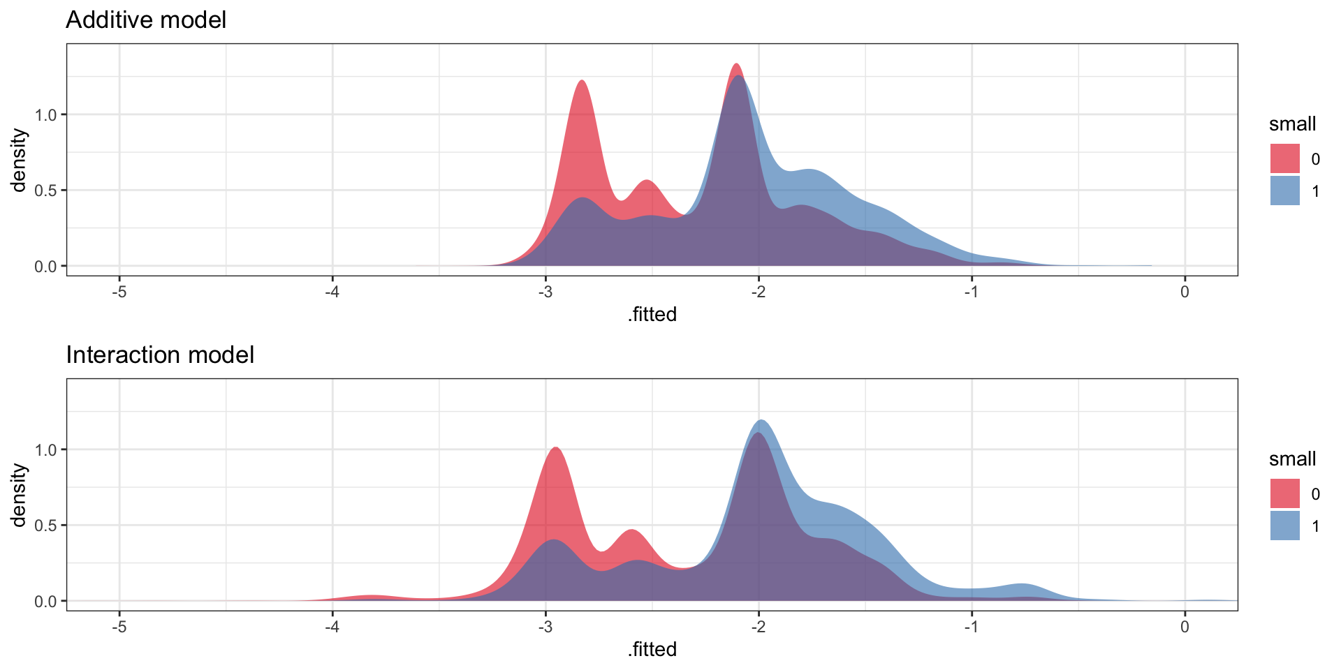
Code
pearson <- function(y, p) (y - p)^2 / (p * (1 - p))
deviance <- function(y, p) ifelse(y == 1, -2 * log(p), -2 * log(1 - p))
Err <- tibble(
    model = c("Additive (CV)", "Interaction (CV)"),
    Pearson = c(
        pearson(birth_weight$small, cv(form, birth_weight)) |> mean(),
        pearson(birth_weight$small, cv(form_int, birth_weight)) |> mean()
    ),
    Deviance = c(
        deviance(birth_weight$small, cv(form, birth_weight)) |> mean(),
        deviance(birth_weight$small, cv(form_int, birth_weight)) |> mean()
    ),
    AUC = c(
        auc(birth_weight$small, cv(form_int, birth_weight)),
        auc(birth_weight$small, cv(form_int, birth_weight))
    )
)
rbind(err, Err)
# A tibble: 4 × 4
model Pearson Deviance AUC
<chr> <dbl> <dbl> <dbl>
1 Additive (train) 0.992 0.642 0.643
2 Interaction (train) 1.00 0.634 0.656
3 Additive (CV) 1.00 0.645 0.626
4 Interaction (CV) 1.06 0.647 0.628The expected generalization errors, estimated above using cross-validation, show that the training errors were all optimistic. The two models become almost identical in terms of both deviance and in terms of AUC.
10.3.4.1 GLMNET
Explanations of what glmnet does are outstanding.
Code
X <- model.matrix(small_glm_int)[, -1]
small_glmnet <- cv.glmnet(
    x = X,
    y = birth_weight$small,
    family = "binomial"
)
Code
plot(small_glmnet)
abline(h = 0.644, col = "blue")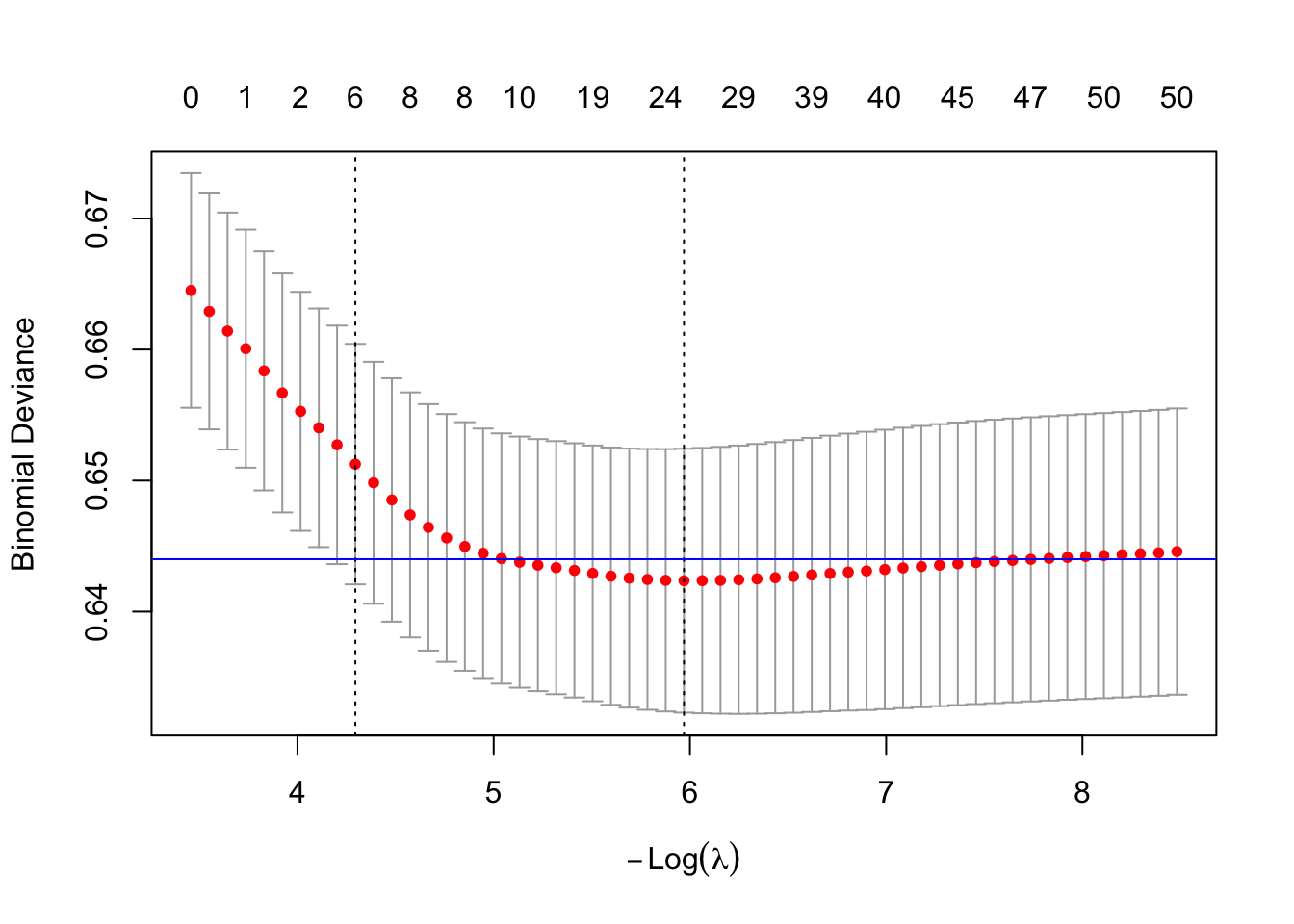
Code
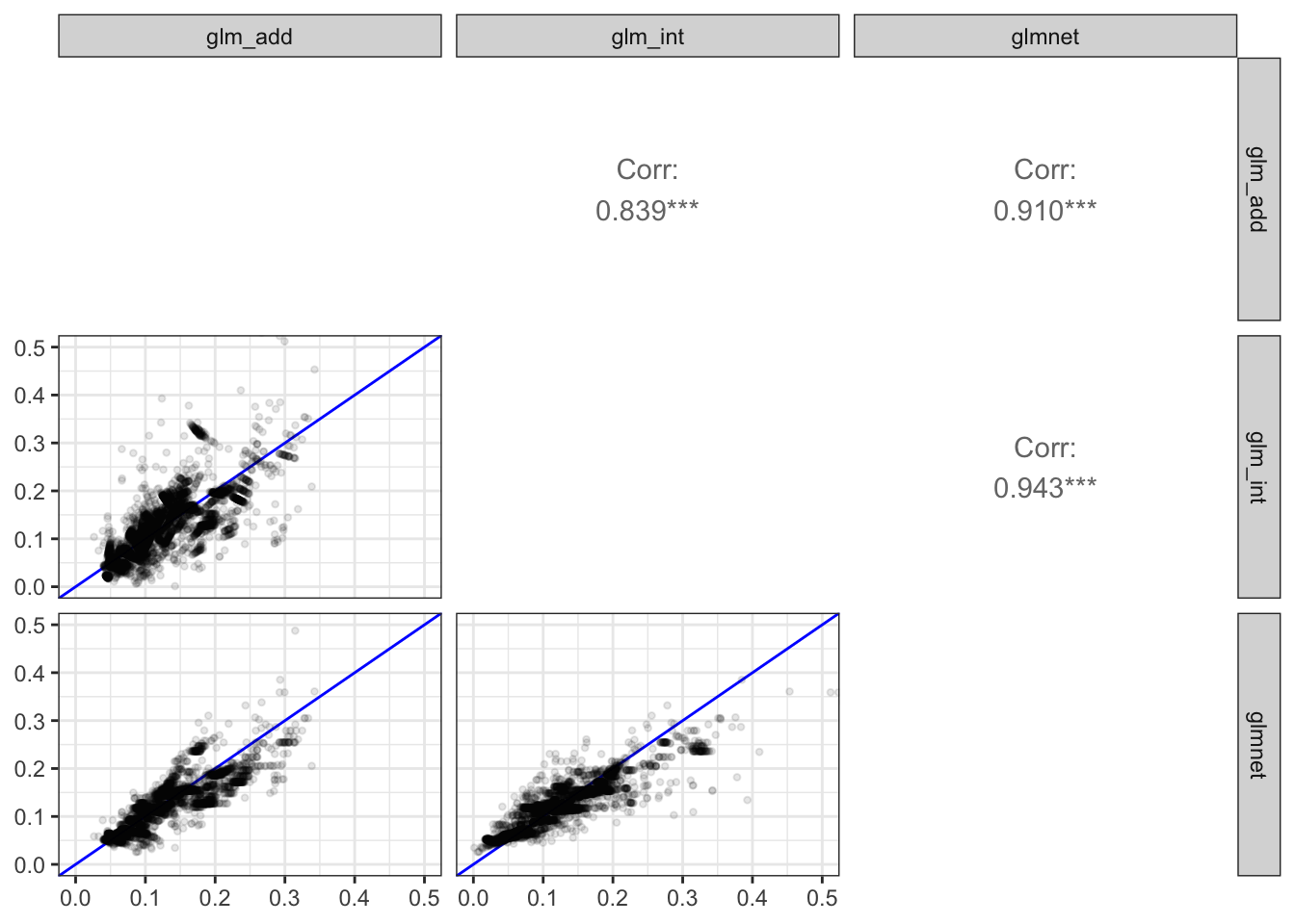
tibble(
    glm_add = predict(small_glm, type = "response"),
    glm_int = predict(small_glm_int, type = "response"),
    glmnet = drop(predict(small_glmnet, newx = X, s = "lambda.min", type = "response"))
) |>
    GGally::ggpairs(
        lower = list(continuous = comp_fit),
        diag = list(continuous = "blankDiag")
    )