library(ggplot2)
library(tibble)
library(broom)
library(splines)
library(readr)
library(skimr)
library(dplyr)7 Advertising – a case study
Warning
This chapter is still a draft and minor changes are made without notice.
In this chapter we consider data extracted from a large database from a major supermarket chain. The primary goal of the supermarket is to predict the number of items sold in specific stores in those weeks where the chain runs an advertising campaign, which consists of a combination of advertisements and discounts. A secondary goal is to assess the effect of the discout and the advertising campaign.
In this chapter we consider the sales of one particular item: frozen vegetables. In reality, the objective would be to build a model for all the items in each store. We focus here on building a model for the sale of frozen vegetables based on data from a few weeks and a selection of stores in the supermarket chain in Sweden.
7.1 Outline and prerequisites
The chapter primarily relies on the following R packages.
7.2 Exploratory data analysis
We load the data from the RwR package.
Code
data(vegetables, package = "RwR")The 7 variables and their encoding in the vegetables data set:
sale: Total number of sold items.normalsale: A proxy of the normal sale in the same week.store: The id-number of the store.ad: Advertising (0 = no advertising, 1 = advertising).discount: Discount in percent.discountSEK: Discount in Swedish kroner.week:Week number (2, 4, 5, 7, 8, 9).
Code
skim(vegetables)Variable type: factor
| skim_variable | n_missing | complete_rate | ordered | n_unique | top_counts |
|---|---|---|---|---|---|
| store | 0 | 1 | FALSE | 352 | 1: 4, 102: 4, 106: 4, 107: 4 |
| ad | 0 | 1 | FALSE | 2 | 0: 687, 1: 379 |
Variable type: numeric
| skim_variable | n_missing | complete_rate | mean | sd | p0 | p25 | p50 | p75 | p100 | hist |
|---|---|---|---|---|---|---|---|---|---|---|
| sale | 0 | 1.00 | 40.29 | 58.44 | 1.00 | 12.00 | 21.00 | 40.00 | 571.00 | ▇▁▁▁▁ |
| normalSale | 0 | 1.00 | 11.72 | 13.83 | 0.20 | 4.20 | 7.25 | 12.25 | 102.00 | ▇▁▁▁▁ |
| discount | 26 | 0.98 | 37.47 | 8.39 | 12.06 | 29.86 | 37.05 | 46.04 | 46.04 | ▁▂▃▃▇ |
| discountSEK | 26 | 0.98 | 9.94 | 2.81 | 2.40 | 7.50 | 10.30 | 12.80 | 12.80 | ▁▃▃▃▇ |
| week | 0 | 1.00 | 6.95 | 1.76 | 2.00 | 7.00 | 7.00 | 8.00 | 9.00 | ▁▃▁▆▇ |
skim() function from the skimr package.
From the summary of the data in Table 7.1 we note that there are 26 missing values of discount and discountSEK. A further investigation shows that it is the same 26 cases for which values are missing for both variables. Moreover, 25 of these cases are the 25 cases from week 2. The last case is from week 4. The cross tabulation of week and ad in Table 7.2 shows that for all other cases, advertising is either \(1\) or \(0\) for all stores within each week except for one case in week 4.
Code
table(vegetables[, c("week", "ad")]) |> knitr::kable()| 0 | 1 | |
|---|---|---|
| 2 | 25 | 0 |
| 4 | 1 | 164 |
| 5 | 0 | 44 |
| 7 | 344 | 0 |
| 8 | 317 | 0 |
| 9 | 0 | 171 |
The only case in week 4 registered as no advertising is also the one where the value of discount and discountSEK is missing. We believe this to be an error in the database.
We have to decide what we do with the 26 cases with missing values. For the 25 cases from week 2 we have no data to support an imputation of the missing values. We could attempt to impute the discount (and correct ad, since we believe it to be registred wrongly) in the last case. We choose, however, to remove all 26 cases with missing values.
We will also reorder the levels for the factor store. The default ordering is the lexicographical order of the factor levels, which in this case amounts to a meaningless and arbitrary ordering. Instead, we order the levels according to the mean normal sale of the stores over the observed weeks.
Code
# Data cleaning
vegetables <- filter(vegetables, !is.na(discount), week != 2)
normal_sale <-
    group_by(vegetables, store) |>
        summarize(
            meanNormSale = mean(normalSale)
        ) |>
        arrange(meanNormSale)

store_order <- as.character(normal_sale$store)

vegetables <- left_join(vegetables, normal_sale) |>
    mutate(
        store = factor(store, levels = store_order)
)| number of weeks | frequency |
|---|---|
| 1 | 28 |
| 2 | 113 |
| 3 | 58 |
| 4 | 153 |
The categorical variable store represents the total of 352 stores. As Table 7.3 show, not all stores are represented each week. Some stores (28) only appear once, while 153 stores appear in a total of four of the five weeks.
The marginal distributions of sale and normalSale are seen in Figure 7.1. It shows that the number of items sold is larger than the normal sale in a distributional sense, which is not surprising given that we are considering the sale in weeks with a discount. Note that we have log-transformed the variables because their distributions are quite right skewed.
Code
p1 <- ggplot(vegetables, aes(sale)) +
    geom_histogram(fill = gray(0.5), bins = 40) +
    scale_x_log10() +
    coord_cartesian(xlim = c(1, 600)) +
    xlab("") + ylab("") + ggtitle("sale")
p2 <- ggplot(vegetables, aes(normalSale)) +
    geom_density(fill = gray(0.5)) +
    scale_x_log10() +
    coord_cartesian(xlim = c(1, 600)) +
    xlab("") + ylab("") + ggtitle("normalSale")
gridExtra::grid.arrange(p1, p2)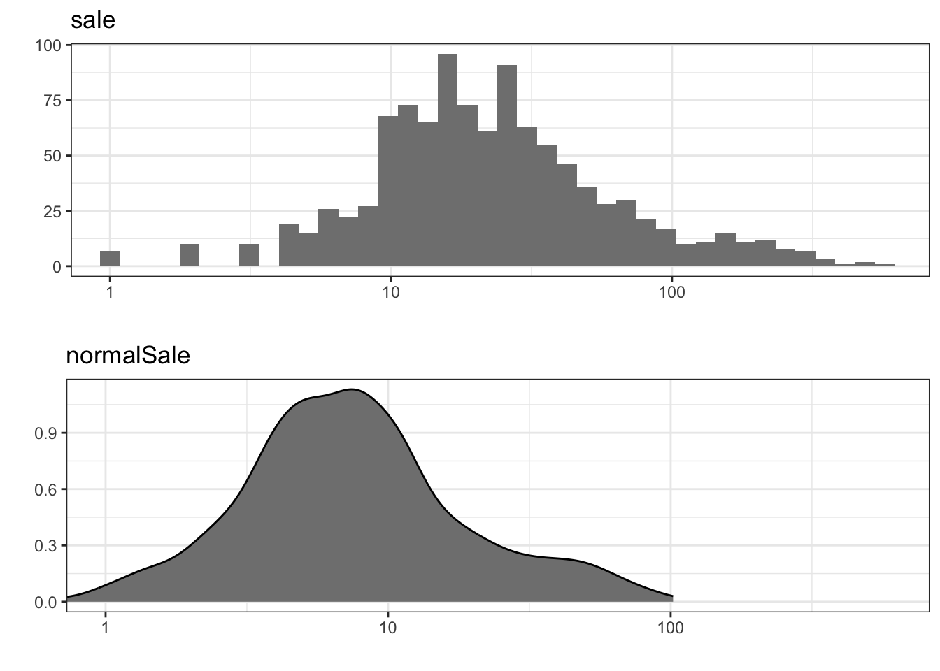
sale and density estimate of normalSale. Note the log-scale on the \(x\)-axis.
The distributions of the two categorical variables ad and week are given in the summary above, and the distributions of the remaining two variables discount and discountSEK are given as barplots in Figure 7.2. We note a quite skewed distribution of discounts with around one-third of the observations corresponding to the largest discount.
Code
p1 <- ggplot(vegetables, aes(discount)) +
    geom_histogram(fill = gray(0.5), bins = 40) +
    xlab("") + ylab("") + ggtitle("Discount")
p2 <- ggplot(vegetables, aes(discountSEK)) +
    geom_histogram(fill = gray(0.5), bins = 40) +
    xlab("") + ylab("") + ggtitle("DiscountSEK")
gridExtra::grid.arrange(p1, p2)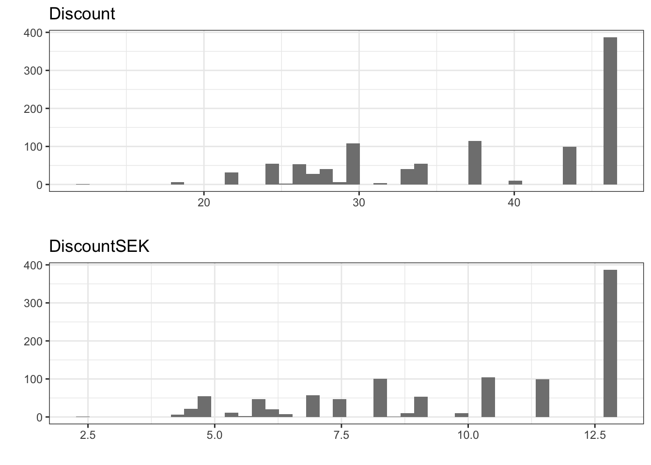
7.2.1 Pairwise associations
We consider scatter plots and Pearson correlations between the 4 continuous variables. As for the histograms we log-transform sale and normalSale.
Code
transform(vegetables, log_sale = log10(sale), log_normalSale = log10(normalSale)) |>
GGally::ggpairs(
    columns = c("log_sale", "log_normalSale", "discount", "discountSEK"),
    lower = list(continuous = GGally::wrap("points", shape = 16, size = 2, alpha = 0.1)),
    diag = list(continuous = "blankDiag")
)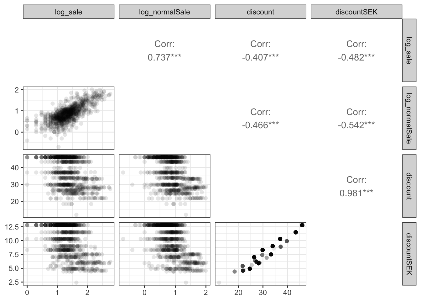
The scatter plot matrix, Figure 7.3, shows that normalsale and sale are quite strongly correlated. As one should expect, discount and discountSEK are also extremely correlated and close to being collinear. It should also be observed that the discount variables and the total sale are strongly negatively correlated. However, as the figure shows, the discount variables are negatively correlated with the normal sale as well. Thus the negative marginal correlation may simply reflect that stores with a larger sale is only present with a smaller discount. Figure 7.4 further shows how the discount and normalSale distributions change depending upon the week number and the advertising variable.
Code
deciles <- function(x) {
  quan <- quantile(x, c(0.1, 0.5, 0.9))
  data.frame(ymin = quan[1], y = quan[2], ymax = quan[3])
}

vegetables_long <- select(vegetables, c(discount, normalSale, ad, week)) |>
    transform(week = as.factor(week)) |>
    tidyr::pivot_longer(cols = c(ad, week))

p1 <- ggplot(vegetables_long, aes(x = value, y = normalSale)) +
  geom_violin(scale = 'width', fill = I(gray(0.8))) +
  scale_y_log10() +
  stat_summary(fun.data = deciles, color = "blue") + xlab("") +
  facet_wrap(~ name, scale = "free_x")

p2 <- ggplot(vegetables_long, aes(x = value, y = discount)) +
  geom_violin(scale = 'width', adjust = 2, fill = I(gray(0.8))) +
  stat_summary(fun.data = deciles, color = "blue") + xlab("") +
  facet_wrap(~ name, scale = "free_x")
gridExtra::grid.arrange(p1, p2, ncol = 1)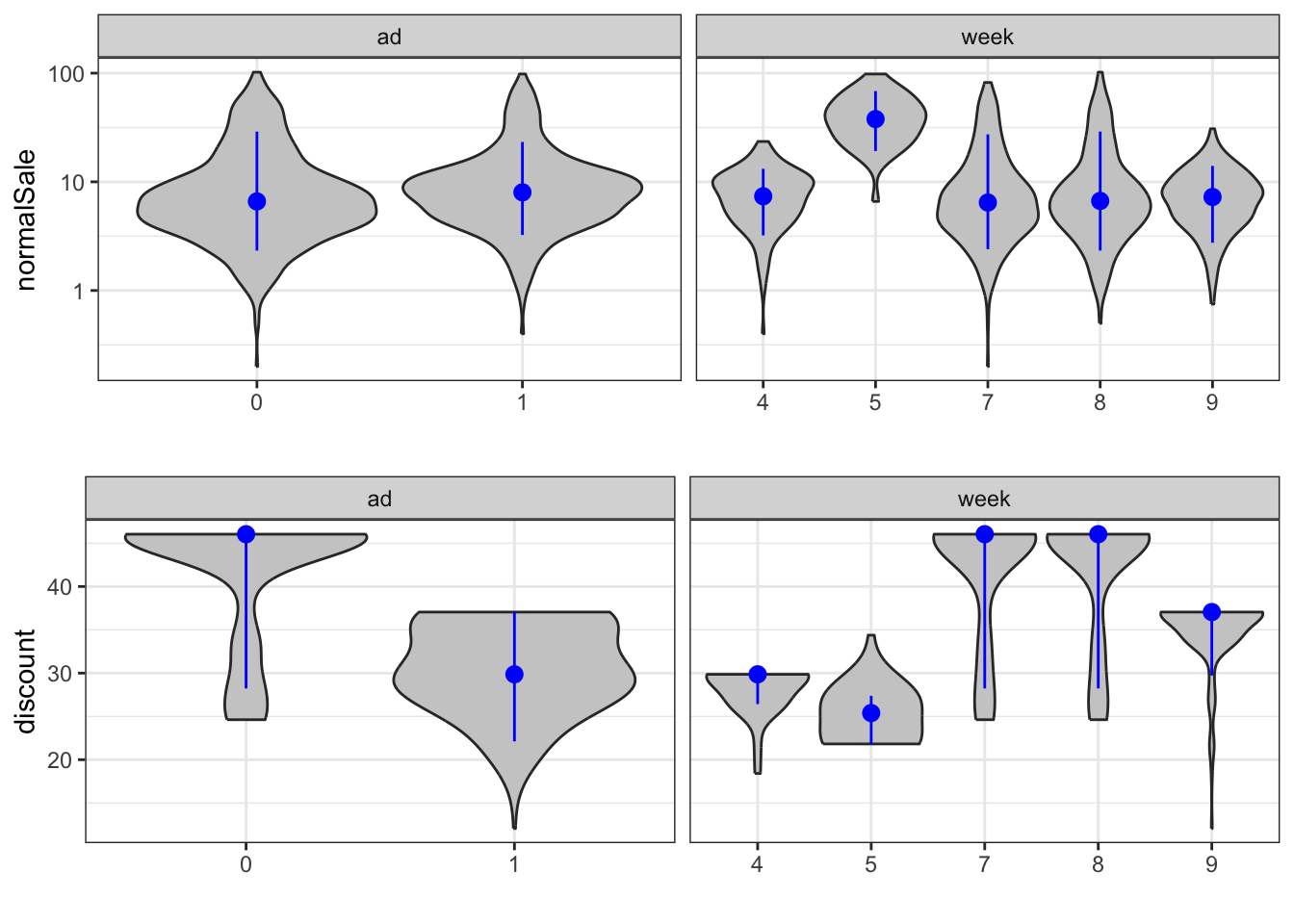
normalSale and discount stratified according to ad and week. A violin plot is a rotated kernel density estimate and can be seen as an alternative to a boxplot.
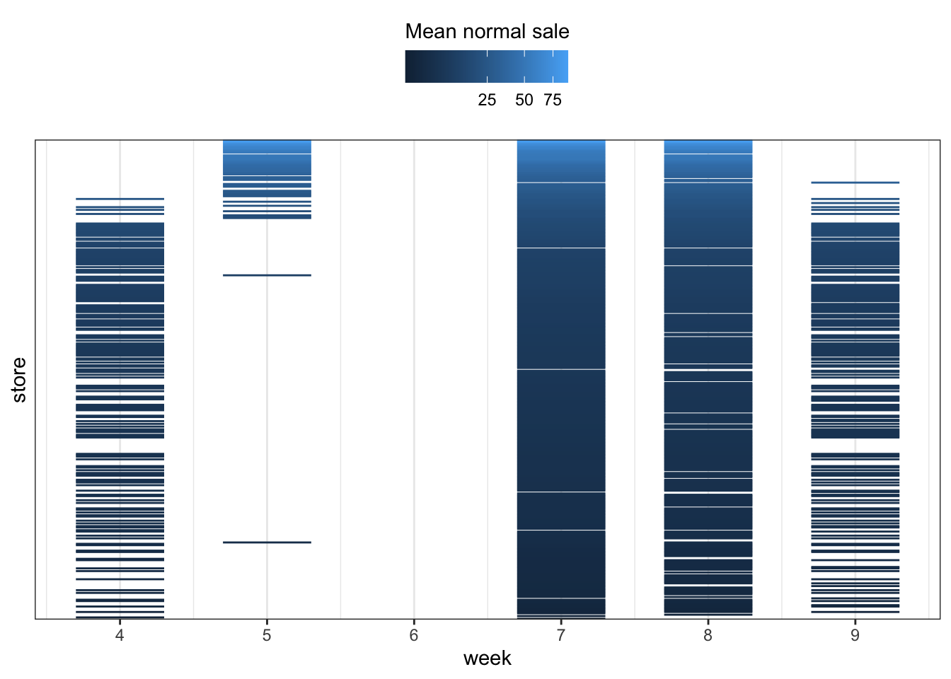
The data consist of observations from different stores (of different sizes) in different weeks, and as mentioned above we don’t have observations from the same stores for all weeks. Since the advertising campaigns run for a given week, we don’t have observations from all stores for all combinations of campaigns. In fact, Figure 7.5 shows that stores with a large normal sale are only included in weeks 5, 7 and 8, and that a considerable number of stores are only included in weeks 7 and 8.
Code
ggplot(vegetables, aes(
        x = store,
        ymin = week - 0.3,
        ymax = week + 0.3,
        group = store,
        color = meanNormSale
    )
) +
    geom_linerange() +
    coord_flip() +
    scale_x_discrete(breaks = c()) +
    scale_y_continuous("week", breaks = c(4, 5, 6, 7, 8, 9)) +
    theme(legend.position = "top") +
    scale_color_continuous(
        "Mean normal sale",
        guide = guide_colorbar(title.position = "top"),
        trans = "sqrt"
) 
To further illustrate this point we consider the relation between the stores and the discount. Figure 7.6 shows that for stores with a large normal sale we only have observations with moderate discounts. This can explain why we observe a negative marginal correlation between the discount and the sale as well as the normal sale.
Code
ggplot(vegetables, aes(discount, store, group = store, color = meanNormSale)) +
    geom_point() +
    scale_y_discrete(breaks = c()) +
    theme(legend.position = "top") +
    scale_color_continuous(guide = "none", trans = "sqrt")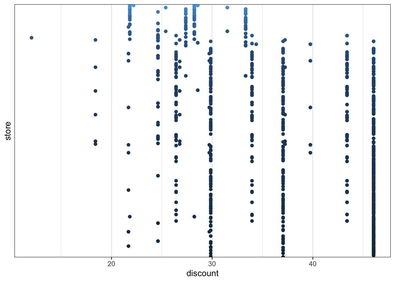
7.3 A Poisson regression model
The supermarket chain has an interest in a predictive model on several levels. We will focus on predictions for the individual store of how many items the store can expect to sell in a week. The predictive model will be based on the store’s normal sale in the week in combination with campaign variables. All observations are from weeks with a discount on the item, but the discounts differ between the weeks.
The response variable \(Y\) is the number of sold items in a given week and in a given store. The proxy variable normalSale is based on historical data and provides, for the given store and week, an estimate of the expected number of sold items without taking advertising campaigns into account. We let \(N\) denote the normal sale. The normal sale is clearly predictive for the number of sold items, as shown by the pairwise association we found in the exploratory analysis. We will attempt to build a model of how to adjust the normal sale with the information on the advertising campaign.
We will consider multiplicative models of the form \[
E(Y \mid N, X) = N e^{X^T \beta} = e^{ \log(N) + X^T \beta}
\tag{7.1}\] where \(X\) is the vector of additional predictors besides the normal sale. This is a log-linear model, that is, a model with an exponential mean value function (a logarithmic link function). This is the default (and canonical) link function for the Poisson response distribution when using the glm() function in R. Since sale is an integer count, it may also be plausible that we can model it with a Poisson distribution.
In the log-linear model above the predictor \(\log(N)\) has a fixed coefficient. Fixing the coefficient of a term in the linear predictor is achieved using the offset() function in the formula specification of the model.
As the very first thing we investigate the marginal association of each of the predictors ad, discount, discountSEK and store using the Poisson regression model that includes the normal sale as an offset. The significance of each predictor is assessed formally by a likelihood ratio test (LRT), that is, a test based on the deviance test statistic, see Definition 6.2.
Code
form <- sale ~ ad + discount + discountSEK + store
null_model <- glm(
    sale ~ offset(log(normalSale)),
    family = poisson,
    data = vegetables
)
one_term_models <- add1(null_model, form, test = "LRT")| term | df | LRT | p.value |
|---|---|---|---|
| store | 351 | 8137.699090 | 0.0000000 |
| discountSEK | 1 | 8.873470 | 0.0028934 |
| ad | 1 | 7.276940 | 0.0069845 |
| discount | 1 | 3.252817 | 0.0713008 |
Table 7.4 shows the results of testing each of the predictors individually with a fixed control for the normal sale. As we see from the table, the predictors are marginally significantly related to the number of sold items, though discount is borderline. This conclusion rests on some model assumptions, in particular the relation between mean and variance that is determined by the Poisson model. Below, we find evidence against this relation in a more general model, and we should not trust the absolute magnitude of the \(p\)-values for these marginal association tests.
Note that week was not included as a predictor. First of all, it would be of limited use in a predictive model, if we can only predict for the weeks included in the data set. Second, the value of ad is completely determined by week, and including both would result in perfect collinearity of the ad column in the design matrix with the columns representing week. The week variable is, however, useful for subsequent model diagnostics.
The next thing we consider is a main effects model including the four predictors linearly and additively. We should remember that discount and discountSEK are highly correlated, and we should expect the collinearity phenomenon that neither of them are significantly related to the response when the other is included.
A main effects model. We could, of course, in this and in subsequent models let
log(normalSale) enter with a coefficient that is estimated. Potential improvements of doing so is investigated in Exercise 7.3.Code
form <- sale ~ offset(log(normalSale)) + store + ad + discount + discountSEK
vegetables_glm <- glm(
    form,
    family = poisson,
    data = vegetables
)
We do not want to consider all the estimated parameters for the individual stores – only the parameters for the other variables. Table 7.5 shows that in this model the relations between sale ad all three variables ad, discount and discountSEK appear to be significant, but somewhat surprisingly, the estimated coefficient of discount is negative. This counter intuitive result makes us suspicious about the model. The collinearity might explain a negative estimate, but it should not be significant then.
Code
vegetables_glm |>
    tidy() |>
    tail(3) |>
knitr::kable()| term | estimate | std.error | statistic | p.value |
|---|---|---|---|---|
| ad1 | 0.3173135 | 0.0321609 | 9.866444 | 0.00e+00 |
| discount | -0.0769348 | 0.0174726 | -4.403175 | 1.07e-05 |
| discountSEK | 0.4164590 | 0.0598074 | 6.963339 | 0.00e+00 |
7.4 Improvements of the Poisson model
The first analysis of the advertising data above resulted in a log-linear Poisson regression model. We should be somewhat suspicious of this model, and before we consider any extensions we will investigate the model fit. For this purpose we first extract the residuals (and other quantities) using the augment() function from the broom package. It will by default extract the deviance residuals, but here we first extract the Pearson residuals, which we immediately use to estimate the dispersion parameter, cf. (6.6).
Code
vegetables_glm_diag <- augment(
    vegetables_glm,
    type.residuals = "pearson"
)
# Estimated dispersion parameter
vegetables_glm_diag$.resid^2 |> sum() / 685
[1] 11.77101We see that \(\hat{\psi}\) is 11.77, which is notably greater than \(1\). This is indicating that the Poisson regression model does not fit the data, since for the Poisson model the dispersion parameter is fixed and equal to \(1\). When modeling count data it is a common phenomenon, known as over dispersion, that the estimated dispersion parameter is greater than \(1\). This could be due to model mispecification. Either the log-linear model of the mean is wrong, or the variance function \(\mathcal{V}(\mu) = \mu\) entailed by the Poisson model is wrong. However, it can happen that the log-linear model fits the data reasonable well but that there is overdispersion for other reasons, e.g., unobserved heterogeneity or clustering, see Exercise 5.9.
It is possible to adjust the statistical analysis for overdispersion via the quasi Poisson family. The quasi Poisson family does not correspond to an actual exponential dispersion model on the integers – there is no exponential dispersion model on the integers with mean \(\mu\) and variance \(\psi \mu\) for all dispersion parameters \(\psi > 0\), see Exercise 5.8. The quasi family is just a way to specify a mean-variance relation that allows for a dispersion parameter. We fit the same main effects Poisson regression model as above, but using the quasi Poisson family. We then extract the estimated dispersion parameter via the summary() function – an estimate that is identical to the one we computed above via the Pearson residuals.
Code
vegetables_quasi_glm <- glm(
    form,
    family = quasipoisson,
    data = vegetables
)
summary(vegetables_quasi_glm)$dispersion
[1] 11.77102Table 7.6 shows the parameter estimates using the quasi Poisson model for the same three parameters as in Table 7.5. We note that the actual estimates are identical1, but standard errors and \(p\)-values are larger – reflecting that the estimated dispersion parameter is greater than \(1\). In fact, the discount and discountSEK parameters no longer appear to be significantly different from \(0\). This aligns with our previous observation that these two variables are almost collinear.
1 This is unsurprising as the dispersion parameter does not affect the score equation for generalized linear models.
Code
tidy(vegetables_quasi_glm) |> tail(3) |> knitr::kable()| term | estimate | std.error | statistic | p.value |
|---|---|---|---|---|
| ad1 | 0.3173135 | 0.1103405 | 2.875766 | 0.0041557 |
| discount | -0.0769348 | 0.0599465 | -1.283391 | 0.1997891 |
| discountSEK | 0.4164590 | 0.2051926 | 2.029600 | 0.0427833 |
To further investigate the model fit we turn to residual plots.
Code
p1 <- ggplot(vegetables_glm_diag, aes(.fitted, .resid)) +
    geom_point(alpha = 0.3) +
    geom_smooth(linewidth =  1, fill = "blue") +
    xlab("fitted values") + ylab("Pearson residuals")
p2 <- ggplot(vegetables_glm_diag, aes(.fitted, sqrt(abs(.resid)))) +
    geom_point(alpha = 0.3) +
    geom_smooth(linewidth =  1, fill = "blue") +
    xlab("fitted values") + ylab("sqrt(|Pearson residuals|)")
gridExtra::grid.arrange(p1, p2, ncol = 2)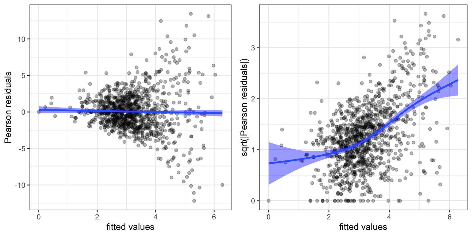
Figure 7.7 shows three things. First, the residuals are generally centered around zero, and there is no clear indication that the mean value is misspecified. Second, as we already know, there is a clear overdispersion in the model corresponding to the Poisson distribution (the residuals are too large). Third, the linear relation between mean and variance, that the Poisson model dictates, is not appropriate. This is revealed both in the funnel shape in Figure 7.7 of the ordinary residual plot (left) and in the non-constant relation between the square root of the absolute value of the residuals as a function of the fitted values (right).
We should note that the “fitted values” in Figure 7.7 are the linear predictors. This is the default scale used by augment(), and it is known as the link scale. If we need the fitted mean values we can either transform the fitted values from the link scale by the mean value function. In this example by the exponential function. We can alternatively set argument type.predict = "response" in augment(), which will give the fitted values on the response scale. For making residual plots it is typically best to use the link scale.
The residuals plot above were based on the Pearson residuals. We can also consider the deviance residuals.
Code
vegetables_glm_diag2 <- augment(vegetables_glm)
p1 <- ggplot(vegetables_glm_diag2, aes(.fitted, .resid)) +
    geom_point(alpha = 0.3) +
    geom_smooth(linewidth =  1, fill = "blue") +
    xlab("fitted values") + ylab("deviance residuals")
p2 <- ggplot(vegetables_glm_diag2, aes(.fitted, sqrt(abs(.resid)))) +
    geom_point(alpha = 0.3) +
    geom_smooth(linewidth =  1, fill = "blue") +
    xlab("fitted values") + ylab("sqrt(|deviance residuals|)")
gridExtra::grid.arrange(p1, p2, ncol = 2)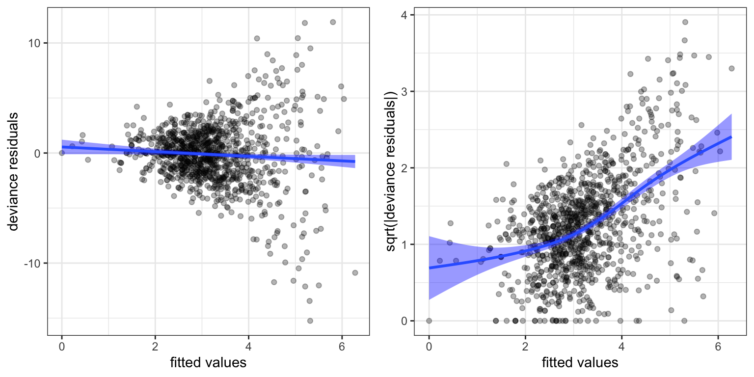
Figure 7.8 is quite similar to Figure 7.7, and the conclusions are the same. The mean-variance relation given by the variance function \(\mathcal{V}(\mu) = \mu\) does not fit the data, and we need a variance function that increases more rapidly.
The Gamma model has variance function \(\mathcal{V}(\mu) = \mu^2\), and we will therefore try that model, but still with a log-link function. For the subsequent models we will also exclude discountSEK due to its collinearity with discount. We fit two models. One where the predictors enter linearly and additively and an additive model with a spline basis expansion of discount using natural cubic splines with 3 internal knots.
Code
form <- sale ~ offset(log(normalSale)) + store  + ad + discount
vegetables_gamma_glm <- glm(
  form,
  family = Gamma("log"),
  data = vegetables
)
form <- sale ~ offset(log(normalSale)) + store  + ad +
  ns(discount, knots = c(20, 30, 40), Boundary.knots = c(0, 50))
vegetables_gamma_glm_spline <- glm(
  form,
  family = Gamma("log"),
  data = vegetables
)
Figure 7.9 shows several diagnostic plots. It is clear from these plots that both \(\Gamma\)-models fit the data well – also in terms of the mean-variance relation. The figure additionally shows the fitted values from the two models plotted against each other. The points all fall very close to the diagonal, which shows that the two models are almost identical in terms of predictions. That is, the inclusion of the nonlinear spline expansion does not change the predicted values by very much.
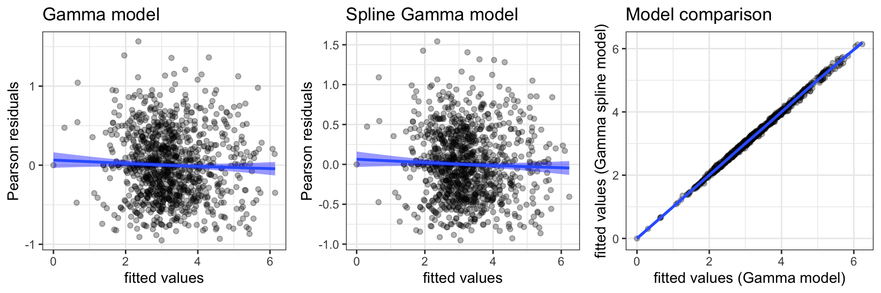
Now that we have developed models that fits the data reasonably well, it makes more sense to consider formal tests. The decision to include the nonlinear expansion of discount can, for instance, be justified by a likelihood ratio test. In the glm jargon the likelihood ratio test statistic is known as the deviance, and it is computed as the difference in deviance between the two (nested) models.
Code
anova(
  vegetables_gamma_glm,
  vegetables_gamma_glm_spline,
  test = "LRT"
) |> tidy() |> knitr::kable()| term | df.residual | residual.deviance | df | deviance | p.value |
|---|---|---|---|---|---|
| sale ~ offset(log(normalSale)) + store + ad + discount | 686 | 229.6964 | NA | NA | NA |
| sale ~ offset(log(normalSale)) + store + ad + ns(discount, knots = c(20, 30, 40), Boundary.knots = c(0, 50)) | 683 | 227.2337 | 3 | 2.46273 | 0.0293166 |
discount against a linear effects model.
To conclude the analysis illustrate predictions from the model. Since there are many stores we need to summarize the model somehow. We do this by choosing a few stores representing different coefficients. One of these, store 206, has regression coefficient -3.1, which is the median coefficient, and we refer to this store as the typical store. For this store we present predictions and confidence bands corresponding to a normal sale of one item.
Code
pred_frame <- expand.grid(
  normalSale = 1,
  store = factor(c(91, 84, 66, 206, 342, 256, 357)),
  ad = factor(c(0, 1)),
  discount = seq(10, 50, 1)
)

pred_sale <- predict(
  vegetables_gamma_glm_spline,
  newdata = pred_frame,
  se.fit = TRUE
)

pred_sale0 <- predict(
  vegetables_gamma_glm,
  newdata = pred_frame,
  se.fit = TRUE
)

pred_frame0 <- cbind(pred_frame, as_tibble(pred_sale0))
pred_frame <- cbind(pred_frame, as_tibble(pred_sale))

p1 <- filter(pred_frame, store == 206) |>
  ggplot(aes(discount, exp(fit))) +
  geom_line() +
  ylab("sale") +
  geom_ribbon(
    aes(
      ymin = exp(fit - 2 * se.fit),
      ymax = exp(fit + 2 * se.fit)
      ),
    alpha = 0.3
    ) +
  geom_line(data = filter(pred_frame0, store == 206), col = "blue", linetype = 2) +
  facet_grid(cols = vars(ad), label = label_both) +
  coord_cartesian(ylim = c(0, 10)) +
  scale_y_continuous(breaks = c(1, 3, 5, 7, 9))

p2 <- ggplot(pred_frame, aes(discount, fit, color = store)) +
  geom_line() +
  geom_line(data = pred_frame0, linetype = 2) +
  ylab("sale") +
  facet_grid(cols = vars(ad), label = label_both) +
  scale_y_continuous("log-sale")

gridExtra::grid.arrange(p1, p2, ncol = 2)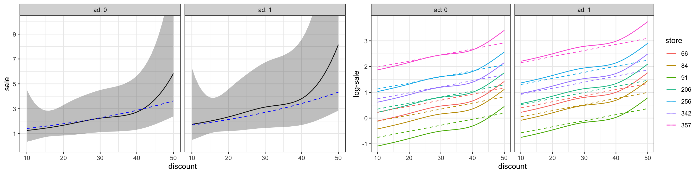
As Figure 7.10 shows, the model predicts that the sale will increase by a factor larger than 1 (larger than 0 on a log-scale) for many stores. The factor is increased if the campaign includes advertising. The model predicts a nonlinear relation between the discount (in percent) and the increase in sale. However, the confidence bands (for the median store) show that the predictions are estimated with a large uncertainty. The differences to the predictions from the linear model (dashed lines in Figure 7.10) are small, and even if we could justify the nonlinear model by the formal likelihood ratio test, the actual differences are small and uncertain.
Exercises
Exercise 7.1 This exercise uses the data set carInsurance from the R package RwR. The data set contains data on insurance claims cross-tabulated according to the three variables Age, District and Motor:
Ageis an ordered categorical variable specifying the age range in years of the policy holder. The possible values are25(less than 25 years),25-29,30-35and35(more than 35 years).Districtis categorical taking the valuesA,B,CandD. (Dis major cities).Motoris an ordered categorical variable specifying the size of the motor in liters. The possible values are1(less than a 1l motor),1-1.5,1.5-2and2(more than a 2l motor).
The data set consists of the number of claims \(Y_i\) and the total number \(N_i\) of policy holders for the \(i\)-th group in addition to the three categorical variables.
We will consider models of the form \(Y_i \sim \text{Pois}(\mu_i)\) with \[ \mu_i = N_i e^{X_i^T\beta}, \] where \(X_i\) is a vector of predictors for the \(i\)-th group derived from the categorical variables. In this model, \[ p_i = \frac{\mu_i}{N_i} = e^{X_i^T\beta} \] is the proportion of claims in the \(i\)-th group. We are interested in a model of these proportions.
The second order interaction model, which has the symbolic description
Age * District * Motor
is the saturated model where each group has its own mean, and thus its own proportion.
- Plot the estimates of the proportions of claims in the saturated model against
Motorstratified according toAgeandDistrict. Add confidence intervals to the point estimates.
Hint: Such a plot is most easily produced using ggplot(). Confidence intervals can be added with geom_errorbar(). Note that the estimates and confidence intervals can be computed using elementary computations as well as using glm.
Fit the model with additive main effects of the three categorical variables. The additive main effects model has the symbolic description
Age+District+Motor.Investigate the model fit and compare it with the saturated model.
Hint: The investigation can include, but is not limited to, a test of the additive main effects model against the saturated model. In the next question you are asked to investigate the distribution of the deviance test statistic, but for this question, you can rely on standard approximations.
- Investigate using simulations under the fitted additive model if the deviance test statistic for the additive main effects model against the saturated model follows the approximate \(\chi^2\)-distribution that the theory suggests.
Exercise 7.2 This exercise is on the relation between mean and variance for counts of small water organisms (Polychaeta). The dataset polychaeta from the R package RwR contains counts from samples taken at different stations in Odense Fjord.
The data set contains the integer response variable Count (which is, in fact, inferred from the weight of the total number of organisms) and the variable Station (numbered 1 to 45, and with between 7 and 48 observations per station).
It can be assumed throughout that the response is given as \[ Y_i = \mu_i + \varepsilon_i \] with \(E(\varepsilon_i) = 0\), \(V(\varepsilon_i) = \psi \mathcal{V}(\mu_i)\) and \[ \mu_i = \beta_{\mathrm{Station}_i} \] being a station specific mean value. Note that even if the response is integer valued, the observed counts are relatively large, hence it does make sense to use, e.g., a normal distribution as response distribution.
- Estimate the station specific mean values and investigate if the variance can be assumed constant. That is, investigate if the variance function can be assumed to be \(\mathcal{V}(\mu) = 1\).
Taylor’s Law is an empirical law established in ecology. It states that there is a power law relationship between mean and variance when counting organisms. Specifically, that the variance function is given as \[ \mathcal{V}(\mu) = \mu^b \] for some power \(b \geq 0\). The objective of the following is to estimate \(b\). To this end introduce \(\xi_i = E(\varepsilon_i^2)\).
Show that if Taylor’s law holds then \[ \log(\xi_i) = \log(\psi) + b \log \mu_i. \] Show that if \(\varepsilon_i\) is normally distributed then \(V(\varepsilon_i^2) = 2 \xi_i^2\).
Show that Taylor’s law in general implies that \[ V(\varepsilon_i^2) = \xi_i^2 (\mathrm{kurt}_i - 1) \] provided that \(\varepsilon_i\) has finite fourth moment, and with \(\mathrm{kurt}_i\) denoting the kurtosis2 of \(\varepsilon_i\).
2 The convention is that kurtosis, denoted by \(\mathrm{kurt}\), is the fourth standardized moment, while \(\mathrm{kurt} - 3\) is excess kurtosis, which is 0 for the normal distribution. This convention concurs with Wikipedia.
- Still assuming that Taylor’s law holds use an appropriate generalized linear model to estimate the parameter \(b\) for the Polychaeta counts by using the squared residuals \[ \hat{\varepsilon}_i^2 = (Y_i - \hat{\mu}_i)^2 \] as responses. Check if Taylor’s law holds for the Polychaeta counts and compute a 95% confidence interval for \(b\).
The residuals are used as approximations of the \(\varepsilon_i\)-s since the latter are not observed.
Exercise 7.3 Consider the generalization of (7.1) where the logarithm of the normal sale does not have a fixed coefficient: \[ \log(E(Y \mid N, X)) = \gamma \log(N) + X^T \beta. \] That is, it does not enter as an offset in the formula specifications of the generalized linear models. Fit such models to the vegetables data and compare the resulting models to the Poisson or Gamma models considered throughout the chapter.