library(ggplot2)
library(tibble)
library(broom)
library(splines)
library(readr)
library(skimr)
library(dplyr)3 Birth weight – a case study
Warning
This chapter is still a draft and minor changes are made without notice.
The question that we address in this case study is how birth weight of children is associated with a number of other observable variables. The dataset comes from a sub-study of The Danish National Birth Cohort Study. The Danish National Birth Cohort Study was a nationwide study of pregnant women and their offspring (Olsen et al. 2001). The included pregnant women completed a computer assisted telephone interview, scheduled to take place in pregnancy weeks 12-16 (for some, the interview took place later). We consider data on women interviewed before pregnancy week 17, who were still pregnant in week 17. One of the original purposes of the sub-study was to investigate if fever episodes during pregnancy were associated with fetal death.
Olsen, Jørn, Mads Melbye, Sjurdur F. Olsen, Thorkild I. A. Sørensen, Peter Aaby, Anne-Marie Nybo Andersen, Dorthe Taxbøl, et al. 2001. “The Danish National Birth Cohort - Its Background, Structure and Aim.” Scandinavian Journal of Public Health 29 (4): 300–307.
We focus on birth weight as the response variable of interest. If \(Y\) denotes the birth weight of a child, the objective is to find a good predictive model of \(Y\) given a relevant set of predictor variables \(X\). What we believe to be relevant can depend upon many things, for instance, that the variables used as predictors should be observable when we want to make a prediction.
Causal mechanisms (known or unknown) may also be taken into account. If coffee happened to be a known course of preterm birth, and if we are interested in estimating a total causal effect of drinking coffee on the birth weight, we should not include the gestational age (age of fetus) at birth as a predictor variable. If, on the other hand, there are unobserved variables associated with coffee drinking as well as preterm birth, the inclusion of gestational age might give a more appropriate estimate of the causal effect of coffee. We will return to this discussion in subsequent sections – the important message being that the relevant set of predictors may very well be a subset of the variables in the dataset.
3.1 Outline and prerequisites
The chapter primarily relies on the following R packages.
3.2 Exploratory data analysis
First, we obtain the dataset by reading it from the csv file included in the RwR package (Requires RwR version >= 0.3.1).
Code
birth_weight_file <- system.file("extdata/birth_weight.txt", package = "RwR")
birth_weight <- read_table(
    birth_weight_file,
    col_types = cols(
        interviewWeek = col_character(),
        fetalDeath = col_factor(levels = c("0", "1")),
        abortions = col_factor(levels = c("0", "1", "2", "3")),
        children = col_factor(levels = c("0", "1")),
        smoking = col_factor(levels = c("1", "2", "3")),
        coffee = col_factor(levels = c("1", "2", "3")),
        feverEpisodes = col_integer())
)
Mistakes are easily made if the classes of the columns in the data frame are not appropriate.
The read_table() function infers the column types automatically if they are not specified. For this dataset several of the categorical variables are encoded using integers. This is the reason for the explicit specification of the column classes above.
It is always a good idea to check that the data was read correctly, that the columns of the resulting data frame have the correct names and are of the correct class, and to check the dimensions of the resulting data frame using dim(), nrow() or ncol(). This dataset has 12 variables and 11817 cases (rows).
| interviewWeek | fetalDeath | age | abortions | children | gestationalAge | smoking | alcohol | coffee | length | weight | feverEpisodes |
|---|---|---|---|---|---|---|---|---|---|---|---|
| 14 | 0 | 36.73374 | 0 | 1 | 40 | 1 | 0.0 | 1 | NA | NA | 0 |
| 12 | 0 | 34.98700 | 0 | 1 | 41 | 3 | 2.0 | 2 | 53 | 3900 | 2 |
| 13 | 1 | 33.70021 | 0 | 0 | 35 | 1 | 0.0 | 1 | NA | NA | 0 |
| 16 | 0 | 33.06229 | 0 | 1 | 38 | 1 | 4.0 | 2 | 48 | 2800 | 0 |
| 15 | 0 | 31.83299 | 0 | 0 | 40 | 1 | 1.0 | 1 | 54 | 4040 | 0 |
| 13 | 0 | 33.02943 | 0 | 1 | 42 | 1 | 0.5 | 1 | 53 | 3600 | 1 |
NA, partly due to fetal death.
The 12 variables and their encoding in the birth weight dataset.
interviewWeek: Pregnancy week at interview.fetalDeath: Indicator of fetal death (1 = death).age: Mother’s age at conception in years.abortions: Number of previous spontaneous abortions (0, 1, 2, 3+).children: Indicator of previous children (1 = previous children).gestationalAge: Gestational age in weeks at end of pregnancy.smoking: Smoking status; 0, 1–10 or 11+ cigs/day encoded as 1, 2 or 3.alcohol: Number of weekly drinks during pregnancy.coffee: Coffee consumption; 0, 1–7 or 8+ cups/day encoded as 1, 2 or 3.length: Birth length in cm.weight: Birth weight in gram.feverEpisodes: Number of mother’s fever episodes before interview.
3.2.1 Descriptive summaries
The first step is to summarize the variables in the dataset using simple descriptive statistics. This is to get an idea about the data and the variable ranges, but also to discover potential issues that we need to take into account in the further analysis. The list of issues we should be aware of includes, but is not limited to,
- extreme observations and potential outliers
- missing values
- skewness or asymmetry of marginal distributions
Anything worth noticing should be noticed. It should not necessarily be written down in a final report, but figures and tables should be prepared to reveal and not conceal.
A quick summary of the variables in a data frame can be obtained with the summary() function. It prints quantile information for numeric variables and frequencies for factor variables. This is the first example where the class of the columns matter for the result that R produces. Information on the number of missing observations for each variable is also given.
Code
skim(birth_weight)Variable type: character
| skim_variable | n_missing | complete_rate | min | max | empty | n_unique | whitespace |
|---|---|---|---|---|---|---|---|
| interviewWeek | 0 | 1 | 1 | 2 | 0 | 10 | 0 |
Variable type: factor
| skim_variable | n_missing | complete_rate | ordered | n_unique | top_counts |
|---|---|---|---|---|---|
| fetalDeath | 39 | 1 | FALSE | 2 | 0: 11659, 1: 119 |
| abortions | 0 | 1 | FALSE | 4 | 0: 9598, 1: 1709, 2: 395, 3: 115 |
| children | 0 | 1 | FALSE | 2 | 1: 6513, 0: 5304 |
| smoking | 0 | 1 | FALSE | 3 | 1: 8673, 2: 1767, 3: 1377 |
| coffee | 4 | 1 | FALSE | 3 | 1: 7821, 2: 3624, 3: 368 |
Variable type: numeric
| skim_variable | n_missing | complete_rate | mean | sd | p0 | p25 | p50 | p75 | p100 | hist |
|---|---|---|---|---|---|---|---|---|---|---|
| age | 0 | 1.00 | 29.63 | 4.20 | 16.29 | 26.64 | 29.48 | 32.48 | 44.91 | ▁▆▇▃▁ |
| gestationalAge | 0 | 1.00 | 39.44 | 2.82 | 17.00 | 39.00 | 40.00 | 41.00 | 47.00 | ▁▁▁▇▁ |
| alcohol | 1 | 1.00 | 0.51 | 0.92 | 0.00 | 0.00 | 0.00 | 1.00 | 15.00 | ▇▁▁▁▁ |
| length | 538 | 0.95 | 51.78 | 5.89 | 0.00 | 51.00 | 52.00 | 54.00 | 99.00 | ▁▁▇▁▁ |
| weight | 538 | 0.95 | 3572.45 | 593.45 | 0.00 | 3250.00 | 3600.00 | 3950.00 | 6140.00 | ▁▁▇▆▁ |
| feverEpisodes | 0 | 1.00 | 0.20 | 0.48 | 0.00 | 0.00 | 0.00 | 0.00 | 10.00 | ▇▁▁▁▁ |
skim() function from the skimr package.
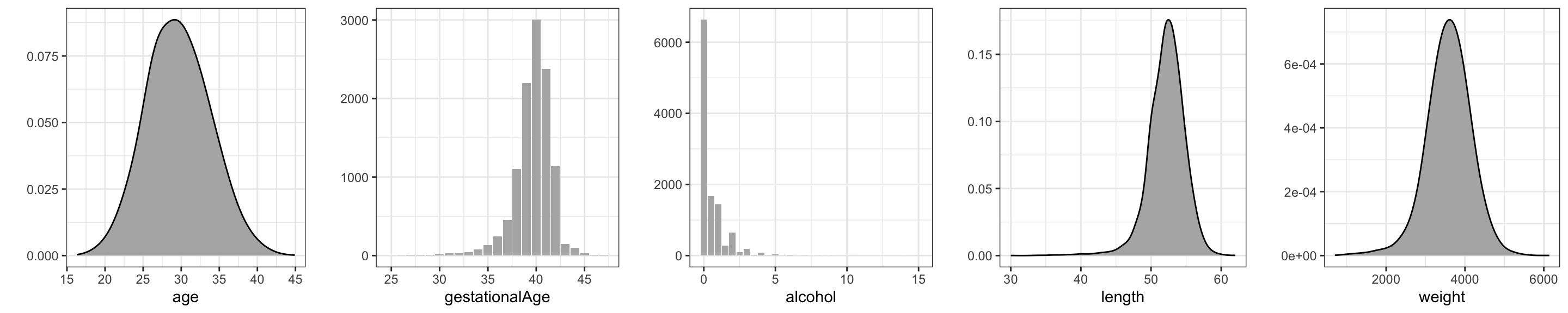
Further investigations of the marginal distributions of the variables in the dataset can be obtained by using histograms, density estimates, tabulations and barplots. Barplots are preferable over histograms for numeric variables that take only a small number of different values, e.g., counts. This is the case for the feverEpisodes variable. Before such figures and tables are produced – or perhaps after they have been produced once, but before they enter a final report – we may prefer to clean the data a little.
We can observe from the data summary in Table 3.1 that for some cases weight or length are missing or registered as \(0\) – and in some other cases weight or length is unrealistically small. These are most likely registration mistakes. Likewise, some lengths are registered as 99, and further scrutiny, e.g., by a scatter plot, reveals an observation with weight 3550 gram but gestationalAge registered as 18. We clean the data by excluding the cases with unrealistic values for some variables. This will leave four cases with missing values of coffee and one with a missing value of alchohol. We exclude those five cases as well, and we, and we also remove the columns interviewWeek and fetalDeath as they will not be used subsequently.
Code
birth_weight <- filter(
  birth_weight,
  weight > 32,
  length > 10 & length < 99,
  gestationalAge > 18
) |>
  na.omit() |>
  select(- c(interviewWeek, fetalDeath))
We present density or histogram estimates of five numerical variables, see Figure 3.1. The density estimates, as the majority of the figures presented in this book, were produced using the ggplot2 package. Readers familiar with ordinary R graphics can easily produce histograms with the hist() function or density estimates with the density() function. For this simple task ggplot() function does not offer much of an advantage – besides the fact that figures have the same style as other ggplot figures. However, the well-thought-out design and entire functionality of ggplot has resulted in plotting methods that are powerful and expressive. The benefit is that with ggplot it is possible to produce quite complicated figures with clear and logical R expressions – and without the need to mess with a lot of low-level technical plotting details.
What is most noteworthy in Figure 3.1 is that the distribution of alcohol is extremely skewed, with more than half of the cases not drinking alcohol at all. This is noteworthy since little variation in a predictor makes it more difficult to detect whether it is associated with the response.
Code
tmp <- lapply(
    names(birth_weight),
    \(x) ggplot(data = birth_weight[, x, drop = FALSE]) +
        aes_string(x) + xlab(x) + ylab("")
)
gd <- geom_density(adjust = 2, fill = gray(0.7))
gb <- geom_bar(fill = gray(0.7))

gridExtra::grid.arrange(
  tmp[[1]] + gd,
  tmp[[4]] + gb,
  tmp[[6]] + gb,
  tmp[[8]] + gd,
  tmp[[9]] + gd,
  ncol = 5
)
For the discrete variables – the categorical or count variables – we produce barplots instead of density estimates. Figure 3.2 shows that all discrete variables except children have quite skewed distributions.
In summary, the typical pregnant woman does not smoke or drink alcohol or coffee, nor has she had any previous spontaneous abortions or any fever episodes. About one-third drinks coffee or alcohol or smokes. These observations may not be surprising – they reflect what is to be expected for a random sample of cases. Little variation of a predictor can, however, make estimation and detection of associations between the response and the predictors more difficult. In this case the dataset is quite large, and cases with the least frequently occurring predictor values are present in reasonable numbers.
Code
gridExtra::grid.arrange(
  tmp[[2]] + gb,
  tmp[[3]] + gb,
  tmp[[5]] + gb,
  tmp[[7]] + gb,
  tmp[[10]] + aes(x = factor(feverEpisodes)) + gb + xlab("feverEpisodes"),
  ncol = 5
)
# The coercion of 'feverEpisodes' to a factor fixes the x-axes.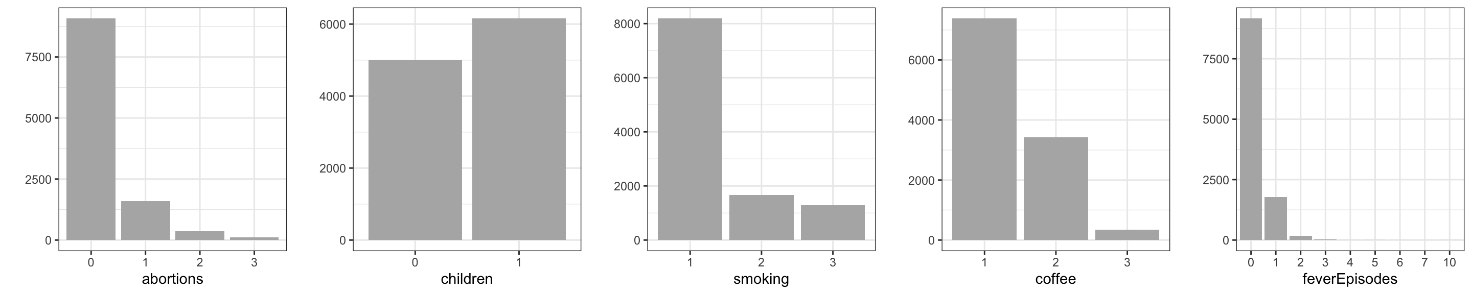
3.2.2 Pairwise associations
The next step is to investigate associations of the variables. We are still not attempting to build a predictive model and the response does not yet play a special role. One purpose is again to get better acquainted with the data – this time by focusing on covariation – but there is also one particular issue that we should be aware of.
- Collinearity of predictors.
Add this bullet point to the previous list of issues. If two or more predictors in the dataset are strongly correlated, they contain, from a predictive point of view, more or less the same information, but perhaps encoded in slightly different ways. Strongly correlated predictors result in the same problem as predictors with little variation. It can become difficult to estimate and detect joint association of the predictors with the response.
A technical consequence is that statistical tests of whether one of the predictors could be excluded become non-significant if the other is included, whereas a test of joint exclusion of the predictors can be highly significant. Thus it will become difficult to determine on statistical grounds if one predictor should be included over the other. It is best to know about such potential issues upfront. Perhaps it is, by subject matter arguments, possible to choose one of the predictors over the other as the most relevant to include in the model.
A scatter plot matrix is a useful graphical summary of the pairwise association of continuous variables. It can be supplemented with computations of Pearson correlations.
Code
ggally_hexbin <- function(data, mapping, ...)
    ggplot(data, mapping) + stat_binhex(...)

GGally::ggpairs(
    birth_weight,
    columns = c("age", "alcohol", "gestationalAge", "length", "weight"),
    lower = list(continuous = GGally::wrap("hexbin", bins = 20)),
    diag = list(continuous = "blankDiag"),
)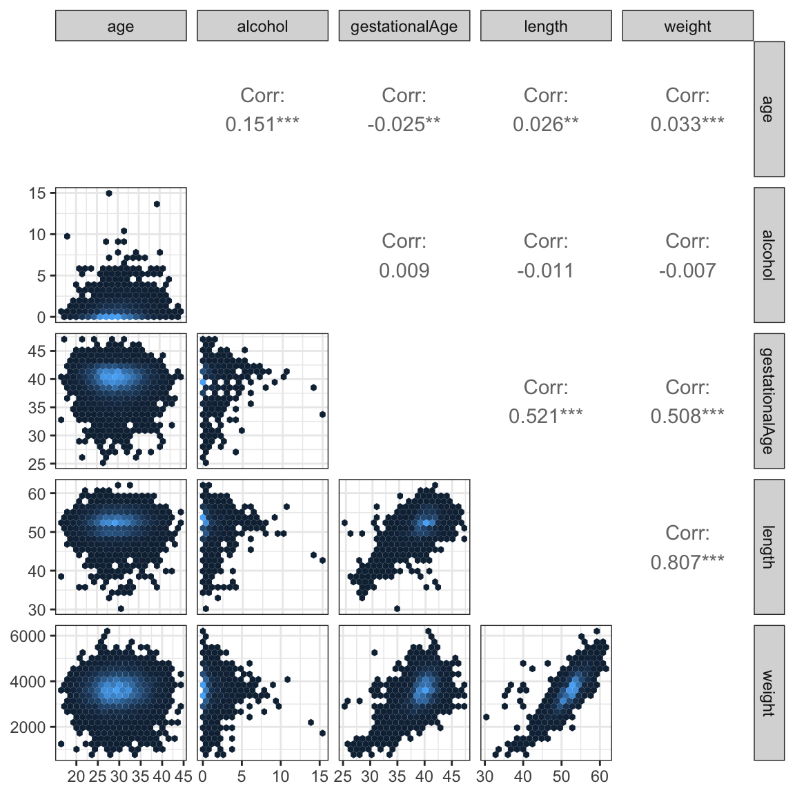
The scatter plots, Figure 12.1, show that length and weight are (not surprisingly) very correlated, and that both of these variables are also highly correlated with gestationalAge. The alcohol and age variables are mildly correlated, but they are virtually uncorrelated with the other three variables.
The scatter plot matrix was produced using the ggpairs() function from the GGally package. The dataset is quite large and a naive plot of a scatter plot matrix results in a lot of overplotting and large pdf graphics files. Figures can be saved as high-resolution png files instead of pdf files to remedy problems with file size. The actual plotting may, however, still be slow, and the information content in the plot may be limited due to the overplotting. A good way to deal with overplotting is to use hexagonal binning of data points. This was done using the custom ggally_hexbin() function based on the stat_hexbin().
If two categorical variables are strongly dependent the corresponding vectors of dummy variable encoding of the categorical levels will be collinear. In extreme cases where only certain pairwise combinations of the categorical variables are observed, the resulting dummy variable vectors will be perfectly collinear. Dependence between categorical variables may be investigated by cross-tabulation and formal tests of independence can, for instance, be computed. However, neither test statistics of independence nor corresponding \(p\)-values are measures of the degree of dependence – they scale with the size of the dataset and become more and more extreme for larger datasets. There is no single suitable substitute for the Pearson correlation that applies to categorical variables in general. In this particular example all the categorical variables are, in fact, ordinal. In this case we can use the Spearman correlation. The Spearman correlation is simply the Pearson correlation between the ranks of the observations. Since we only need to be able to sort observations to compute ranks, the Spearman correlation is well defined for ordinal as well as continuous variables.
Code
cp <- cor(
  data.matrix(birth_weight),
  use = "complete.obs",
  method = "spearman"
)

corrplot::corrplot(
  cp,
  diag = FALSE,
  order = "hclust",
  addrect = 4,
  tl.srt = 45,
  tl.col = "black",
  tl.cex = 0.8
)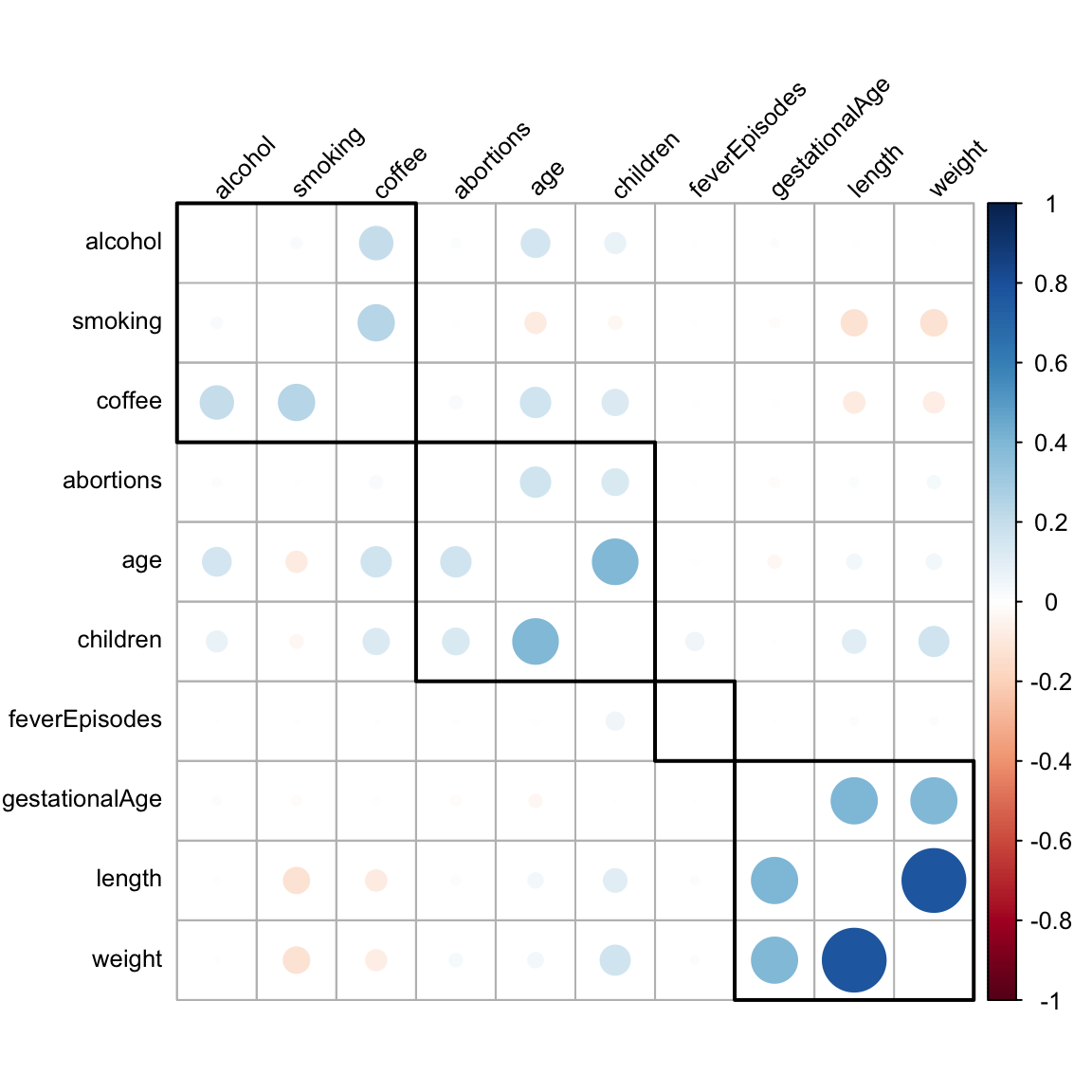
Figure 3.4 shows Spearman correlations of all variables – categorical as well as continuous. For continuous variables the Spearman correlation is, furthermore, invariant to monotone transformations and less sensitive to outliers than the Pearson correlation. These properties make the Spearman correlation more attractive as a means for exploratory investigations of pairwise association.
For the production of the plot of the correlation matrix, Figure 3.4, we used a hierarchical clustering of the variables. The purpose was to sort the variables so that the large correlations are concentrated around the diagonal. Since there is no natural order of the variables, the correlation matrix could be plotted using any order. We want to choose an order that brings highly correlated variables close together to make the figure easier to read. Hierarchical clustering can be useful for this purpose.
What we see most clearly from Figure 3.4 are three groupings of positively correlated variables. The weight, length and gestationalAge group, a group consisting of age, children and abortions (not surprising), and a grouping of alcohol, smoking and coffee with mainly coffee being correlated with the two others.
An alternative way to study the relation between a continuous and a categorical variable is to look at the distribution of the continuous variable stratified according to the values of the categorical variable. This can be done using boxplots.
Figure 3.5 shows boxplots for the continuous variable weight. From this figure we see that weight seems to be larger if the mother has had children before and to be negatively related to coffee drinking and smoking.
Code
birth_weight_long <- tidyr::pivot_longer(
    birth_weight[, c("weight", "abortions", "children", "smoking", "coffee", "feverEpisodes")],
    cols = !weight,
    values_transform = as.factor
)
ggplot(birth_weight_long, aes(x = value, y = weight)) +
  geom_boxplot(fill = gray(0.8), outlier.alpha = 0.1) + xlab("") +
  facet_wrap(~ name, scale = "free_x", ncol = 5)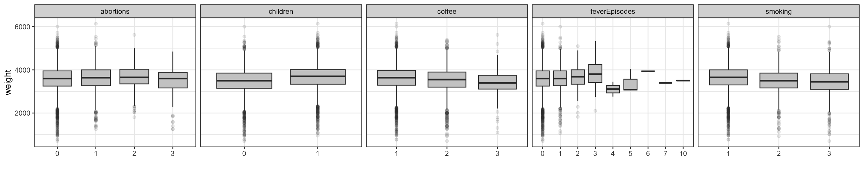
3.3 A linear model of birth weight
Before building any joint regression model we will explore the marginal associations between the other variables and weight in greater details. This analysis should not be used for variable selection – it is a supplement to the exploratory analysis in the previous sections. In contrast to correlation considerations this procedure for studying single predictor association with the response can be generalized to models where the response is discrete.
Code
form <- weight ~ gestationalAge + length + age + children +
  coffee + alcohol + smoking + abortions + feverEpisodes
null_model <- lm(weight ~ 1, data = birth_weight)
one_term_models <- add1(null_model, form, test = "F")
Table 3.3 shows the result of testing if inclusion of each of the predictors by themselves is significant. That is, we test the model with only an intercept against the alternative where a single predictor is included. The test used is the \(F\)-test – see Section 2.6.2 for details on the theory. For each of the categorical predictor variables the encoding requires df (degrees of freedom) dummy variables in addition to the intercept to encode the inclusion of a variable with df + 1 levels.
Code
one_term_models |>
  tidy() |>
  arrange(p.value, desc(statistic)) |>
  filter(term != "<none>") |>
  select(-AIC) |>
knitr::kable()| term | df | sumsq | rss | statistic | p.value |
|---|---|---|---|---|---|
| length | 1 | 2351722932.3 | 1262184175 | 2.077487e+04 | 0.0000000 |
| gestationalAge | 1 | 932314502.1 | 2681592605 | 3.876542e+03 | 0.0000000 |
| children | 1 | 97619557.6 | 3516287550 | 3.095475e+02 | 0.0000000 |
| smoking | 2 | 53321111.0 | 3560585996 | 8.348023e+01 | 0.0000000 |
| coffee | 2 | 21990295.9 | 3591916811 | 3.412799e+01 | 0.0000000 |
| abortions | 3 | 6272999.9 | 3607634107 | 6.461428e+00 | 0.0002294 |
| age | 1 | 3954121.7 | 3609952986 | 1.221303e+01 | 0.0004764 |
| feverEpisodes | 1 | 1085988.3 | 3612821119 | 3.351611e+00 | 0.0671660 |
| alcohol | 1 | 169962.2 | 3613737145 | 5.244098e-01 | 0.4689818 |
Figure 3.6 shows the scatter plots of weight against the 4 continuous predictors. This is actually just the last row in the scatter plot matrix in Figure 12.1, but this time we have added the regression line. For the continuous variables the tests reported in Table 3.3 are tests of whether the regression line has slope \(0\).
Code
birth_weight_long <- tidyr::pivot_longer(
  select(birth_weight, c(age, alcohol, gestationalAge, length, weight)),
  cols = !weight,
  names_to = "variable"
)

binScale <- scale_fill_continuous(
  breaks = c(1, 10, 100, 1000),
  low = "gray80",
  high = "black",
  trans = "log",
  guide = "none"
)

ggplot(birth_weight_long, aes(value, weight)) +
  stat_binhex(bins = 20) + binScale + xlab("") +
  facet_wrap(~ variable, scales = "free_x", ncol =  4) +
  geom_smooth(linewidth = 1, method = "lm")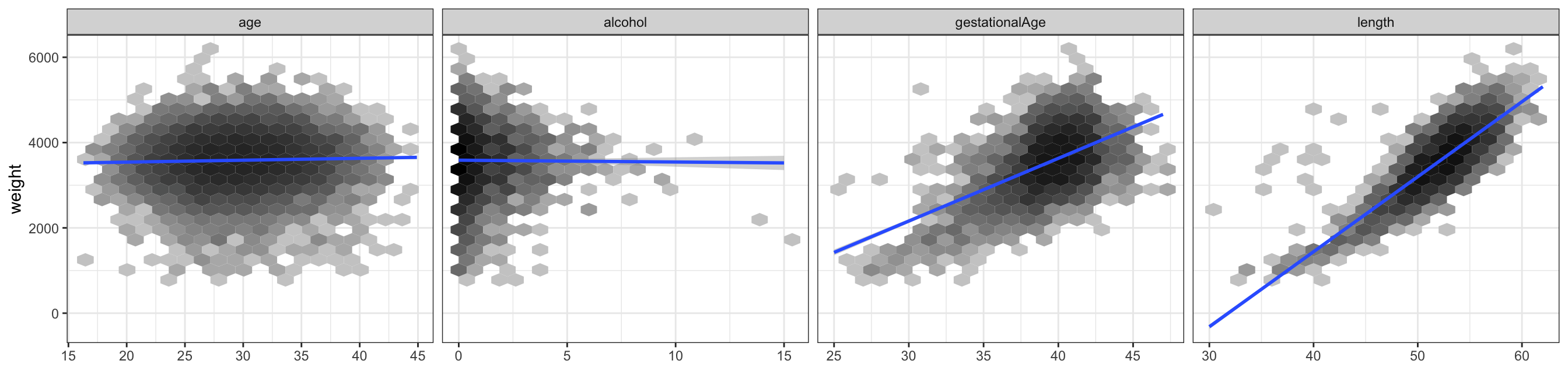
Our primary interest will be to model the relation between gestational age at birth and the birth weight. The scatter plot of weight against gestational age, which is part of the scatter plot matrix in Figure 3.6, shows the strong marginal association. Figure 3.7 gives an alternative graphical illustration of this association.
Code
p_bar <- ggplot(birth_weight, aes(as.factor(gestationalAge))) +
  geom_bar(fill = gray(0.7)) +  theme(
    axis.title.x = element_blank(),
    axis.text.x = element_blank(),
  )
p_box <- ggplot(birth_weight, aes(x = as.factor(gestationalAge), y = weight)) +
  geom_boxplot(fill = gray(0.8), outlier.alpha = 0.1) + xlab("Gestational age")
gridExtra::grid.arrange(p_bar, p_box, heights = c(1, 4))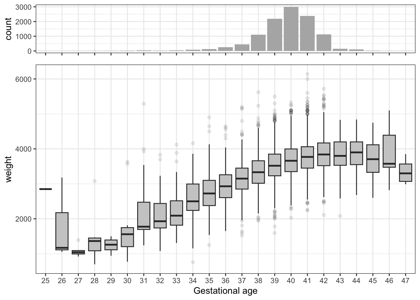
To build a multivariate regression model of the response variable weight, we need to decide which additional predictors we want to include. Our initial analyses showed that length is (unsurprisingly) a very good predictor of weight, but it is also close to being an equivalent “body size” measurement, and it will be affected in similar ways as weight by variables that affect fetus growth. From a predictive modeling point of view it is in most cases useless, as it is will not be observable unless weight is also observable. One may argue that gestationalAge is likewise of little interest if we want to predict weight early in pregnancy. We are, however, mostly interested in what the other predictors add on top of gestationalAge. The exploratory analysis also showed that gestationalAge is virtually unrelated to the other predictors, and age of the fetus at birth is a logic cause of the weight of the child. The remaining predictors are not strongly correlated, and we have not found reasons to exclude any of them. We will thus fit a main effects linear model with eight predictors. We include all the predictors as they are.
The main effects model.
Code
form <- update(form, . ~ . - length)
birth_weight_lm <- lm(form, data = birth_weight)
tidy(birth_weight_lm) |>
knitr::kable()| term | estimate | std.error | statistic | p.value |
|---|---|---|---|---|
| (Intercept) | -2169.444992 | 98.598974 | -22.0027137 | 0.0000000 |
| gestationalAge | 145.160059 | 2.303741 | 63.0105736 | 0.0000000 |
| age | -2.002013 | 1.204674 | -1.6618710 | 0.0965668 |
| children1 | 185.954556 | 9.896906 | 18.7891615 | 0.0000000 |
| coffee2 | -65.539288 | 10.390137 | -6.3078367 | 0.0000000 |
| coffee3 | -141.784319 | 27.241898 | -5.2046418 | 0.0000002 |
| alcohol | -2.749242 | 5.088446 | -0.5402910 | 0.5890072 |
| smoking2 | -101.952291 | 13.049484 | -7.8127448 | 0.0000000 |
| smoking3 | -131.188927 | 14.910537 | -8.7984041 | 0.0000000 |
| abortions1 | 27.842979 | 13.088798 | 2.1272373 | 0.0334223 |
| abortions2 | 48.763060 | 25.445584 | 1.9163663 | 0.0553440 |
| abortions3 | -50.029260 | 45.803151 | -1.0922668 | 0.2747395 |
| feverEpisodes | 6.363578 | 9.393500 | 0.6774448 | 0.4981378 |
Table 3.4 shows the estimated \(\beta\)-parameters among other things. Note that all categorical variables (specifically, those that are encoded as factors in the data frame) are included via a dummy variable representation. The precise encoding is determined by a linear constraint, known as a contrast. By default, the first factor level is constrained to have parameter \(0\), in which case the remaining parameters represent differences to this base level. In this case it is only occasionally of interest to look at the \(t\)-tests for testing if a single parameter is \(0\).
Table 3.5 shows instead \(F\)-tests of excluding any one of the predictors. It shows that the predictors basically fall into two groups; the strong predictors gestationalAge, children, smoking and coffee, and the weak predictors abortions, age, feverEpisodes and alcohol. The table was obtained using the drop1() function. We should at this stage resist the temptation to use the tests for a model reduction or model selection, as this will generally invalidate subsequent statistical analyses unless properly accounted for.
Code
drop1(birth_weight_lm, test = "F") |>
  tidy() |>
  arrange(p.value, desc(statistic)) |>
  filter(term != "<none>") |>
  select(-AIC) |>
knitr::kable()| term | df | sumsq | rss | statistic | p.value |
|---|---|---|---|---|---|
| gestationalAge | 1 | 904499510.74 | 3442125857 | 3970.3323795 | 0.0000000 |
| children | 1 | 80425963.18 | 2618052310 | 353.0325909 | 0.0000000 |
| smoking | 2 | 26628256.86 | 2564254603 | 58.4428345 | 0.0000000 |
| coffee | 2 | 12916211.03 | 2550542557 | 28.3480811 | 0.0000000 |
| abortions | 3 | 2072100.55 | 2539698447 | 3.0318527 | 0.0280891 |
| age | 1 | 629181.69 | 2538255528 | 2.7618151 | 0.0965668 |
| feverEpisodes | 1 | 104551.28 | 2537730898 | 0.4589315 | 0.4981378 |
| alcohol | 1 | 66502.33 | 2537692849 | 0.2919143 | 0.5890072 |
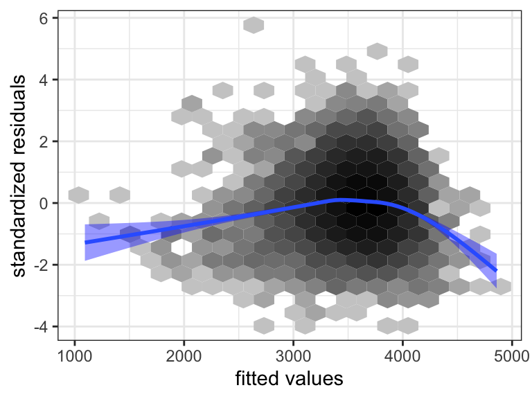
Model diagnostics are then to be considered to justify the model assumptions. Several aspects of the statistical analysis presented so far rely on these assumptions, though the theory is postponed to the subsequent sections. Most notably, the distribution of the test statistics, and thus the \(p\)-values, depend on the strong set of assumptions, A3 + A5. We cannot hope to prove that the assumptions are fulfilled, but we can check – mostly using graphical methods – that they are either not obviously wrong, or if they appear to be wrong, the methods should reveal how we can improve the model.
There exists a plot method for lm objects that can produce a range of standard diagnostic plots. The method is useful for quick interactive usage, but the resulting plots are difficult to customize for publication quality. We develop alternatives based on ggplot2
Model diagnostics for the linear model are mostly based on the residuals, which are estimates of the unobserved errors \(\epsilon_i\), or the standardized residuals, which are estimates of \(\epsilon_i / \sigma\). Plots of the standardized residuals against the fitted values, or against any one of the predictors, are useful to detect deviations from A1 or A2. For A3 we consider a qq-plot against the standard normal distribution. The assumptions A4 or A5 are more difficult to investigate. If we don’t have a specific idea about how the errors, and thus the observations, might be correlated, it is very difficult to do anything.
Code
birth_weight_diag <- augment(birth_weight_lm)
p1 <- ggplot(birth_weight_diag, aes(.fitted, .std.resid)) +
  stat_binhex(bins = 20) + binScale + geom_smooth(linewidth =  1, fill = "blue") +
  xlab("fitted values") + ylab("standardized residuals")
p2 <- ggplot(birth_weight_diag, aes(gestationalAge, .std.resid)) +
  stat_binhex(bins = 20) + binScale + geom_smooth(linewidth =  1, fill = "blue") +
  xlab("gestationalAge") + ylab("")
p3 <- ggplot(birth_weight_diag, aes(sample = .std.resid)) +
  geom_abline(intercept = 0, slope = 1, color = "blue", linewidth =  1) +
  geom_qq() +
  xlab("theoretical quantiles") + ylab("")
gridExtra::grid.arrange(p1, p2, p3, ncol = 3)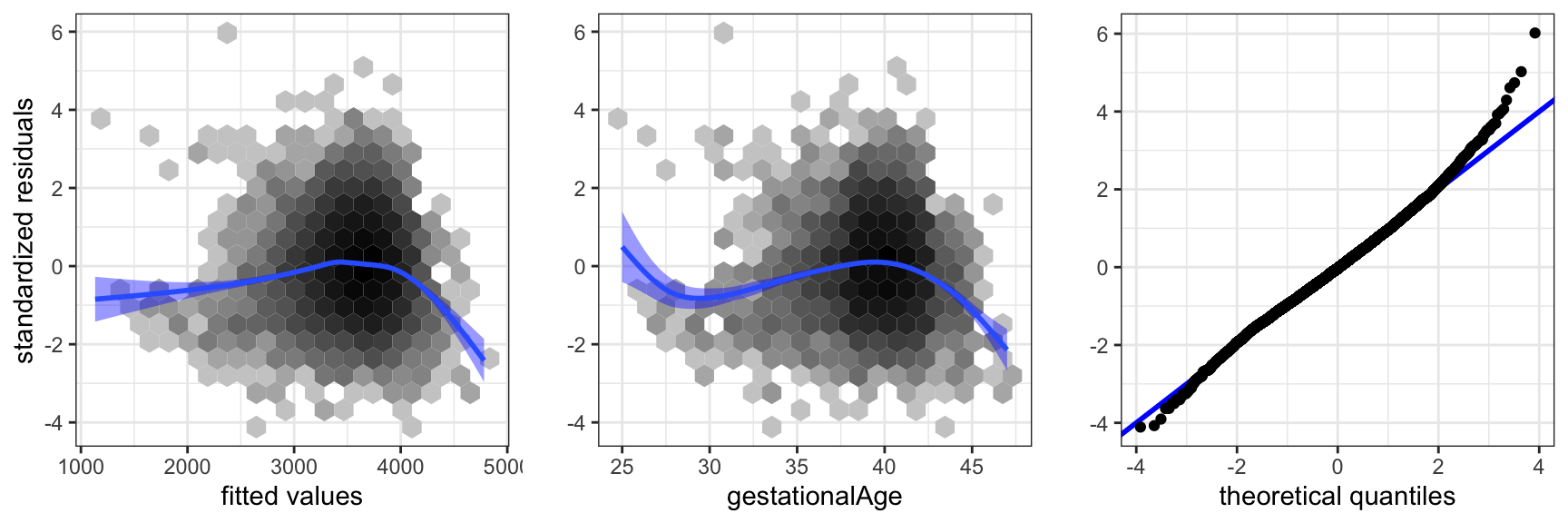
gestationalAge, and a qq-plot against the normal distribution.
The residual plot in Figure 3.8 shows that the model is not spot on. The plot of the residuals against gestationalAge shows that there is a nonlinear effect that the linear model does not catch. Thus A1 is not fulfilled. We address this specific issue in a later section, where we solve the problem using splines. The qq-plot shows that the tails of the residuals are heavier than the normal distribution and right skewed. However, given the problems with A1, this issue is of secondary interest.
The diagnostics considered above address if the data set as a whole does not comply to the model assumptions. Single observations can also be extreme and, for instance, have a large influence on how the model is fitted. For this reason we should also be aware of single extreme observations in the residual plots and the qq-plot.
Interactions between the different predictors can then be considered. The inclusion of interactions results in a substantial increase in the complexity of the models, even if we have only a few predictors. Moreover, it becomes possible to construct an overwhelming number of comparisons of models. Searching haphazardly through thousands of models with various combinations of interactions is not recommended. It will result in spurious discoveries that will be difficult to reproduce in other studies. If there is no specific interactions of particular interest, it is often recommended that one should not to begin searching for any. It may, on the other hand, be of interest to investigate if the data set contains evidence of interactions. The strategy we follow here is to include interactions of the strongest predictors from the main effects model. To comprehend an interaction model it is advisable to visualize the model to the extent it is possible. This is a point where the ggplot2 package is really strong. It supports a number of ways to stratify a plot according to different variables.
Code
ggplot(birth_weight, aes(gestationalAge, weight)) +
  facet_grid(coffee ~ children + smoking, label = label_both) +
  binScale + stat_binhex(bins = 20) +
  geom_smooth(method = "lm", linewidth = 1, se = FALSE, fullrange = TRUE)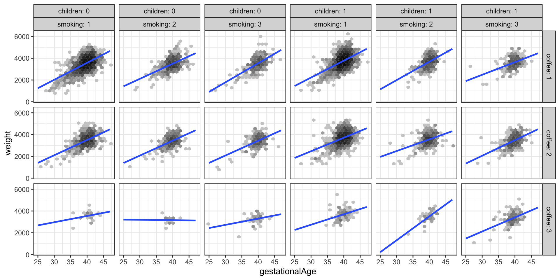
weight against gestationalAge stratified according to the values of smoking, children and coffee
Figure 3.9 shows a total of 18 scatter plots where the stratification is according to children, smoking and coffee. A regression line was fitted separately for each plot. This corresponds to a model with a third order interaction between the 4 strong predictors (and with the weak predictors left out). Variations between the regression lines are seen across the different plots, which is an indication of interaction effects. For better comparison of the regression lines it can be beneficial to plot them differently. Figure 3.10 shows an example where the stratification according to coffee is visualized by color coding the levels of coffee.
Code
ggplot(birth_weight, aes(gestationalAge, weight, color = coffee)) +
  facet_grid(. ~ children + smoking, label = label_both) +
  geom_smooth(method = "lm", linewidth =  1, se = FALSE, fullrange = TRUE)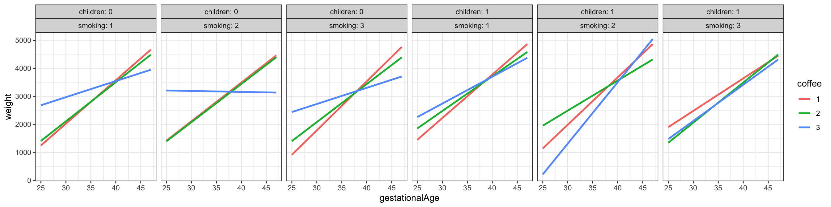
gestationalAge stratified according to the values of smoking, coffee and children
We can test the model with a third order interaction between the strong predictors against the main effects model. In doing so we keep the weak predictors in the model.
Code
form <- weight ~ smoking * coffee * children * gestationalAge +
  age + alcohol + abortions + feverEpisodes
birth_weight_lm_int <- lm(form, data = birth_weight)
anova(birth_weight_lm, birth_weight_lm_int) |>
knitr::kable()| Res.Df | RSS | Df | Sum of Sq | F | Pr(>F) |
|---|---|---|---|---|---|
| 11139 | 2537626346 | NA | NA | NA | NA |
| 11110 | 2514285831 | 29 | 23340516 | 3.55641 | 0 |
Table 3.6 shows that the \(F\)-test of the full third order interaction model against the main effects model is clearly significant. Since there is some lack of model fit, we should be skeptical about the conclusions from formal hypothesis tests. However, deviations from A1 result in an increased residual variance, which will generally result in more conservative tests. That is, it will become harder to reject a null hypothesis, and thus, in this case, conclude that inclusion of the interactions is significant. The third order interaction model contains 42 parameters, so a full table of all the parameters is not very comprehensible, and it will thus not be reported.
We reconsider model diagnostics for the extended model, where we have included the interactions. Figure 3.11 shows the residual plot. The inclusion of the interactions did not solve the earlier observed problems with the model fit. This is hardly surprising as the problem with the model appears to be related to a nonlinear relation between weight and gestationalAge. Such an apparent nonlinearity could be explained by interaction effects, but this would require a strong correlation between the predictors, e.g. that heavy coffee drinkers (coffee = 3) have large values of gestationalAge. We already established that this was not the case.
Before we conclude the analysis, we test the hypothesis where we exclude the 4 weak predictors together. Table 3.7 shows that the test results in a borderline \(p\)-value of around 5%. On the basis of this we might exclude the 4 weak predictors even though Table 3.5 suggested that the number of abortions is related to weight. The highly skewed distribution of abortions resulted in large standard errors and low power despite the size of the data set. In combination with the different signs on the estimated parameters in Table Table 3.4, depending upon whether the woman had had 1, 2 or 3+ spontaneous abortions, the study is inconclusive on how abortions is related to weight.
Code
form <- weight ~ smoking * coffee * children * gestationalAge
birth_weight_lm_int_sub <- lm(form, data = birth_weight)
anova(birth_weight_lm_int_sub, birth_weight_lm_int) |>
knitr::kable()| Res.Df | RSS | Df | Sum of Sq | F | Pr(>F) |
|---|---|---|---|---|---|
| 11116 | 2517158539 | NA | NA | NA | NA |
| 11110 | 2514285831 | 6 | 2872708 | 2.11563 | 0.0482525 |
In conclusion, we have arrived at a predictive model of weight given in terms of a third order interaction of the 4 predictors gestationalAge, smoking, coffee and children. The model is not a perfect fit, as it doesn’t catch a nonlinear relation between weight and gestationalAge. The fitted model can be visualized as in the Figure 3.9 or Figure 3.10.
We note that the formal \(F\)-test of the interaction model against the main effects model justifies the need for the increased model complexity. It is, however, clear from the figures that the actual differences in slopes are small, and the significance of the test reflects that we have a large data set, which makes us able to detect even small differences.
There is no clear-cut interpretation of the interactions either. The regression lines in the figures should, preferably, be equipped with confidence bands. This can be achieved by removing the se = FALSE argument to the geom_smooth() function, but this will result in a separate variance estimate for each combination of smoking, coffee and children. If we want to use the pooled variance estimate obtained by our model, we have to do something else. How this is achieved is shown in a later section, where we also consider how to deal with the nonlinearity using spline basis expansions.
3.4 Nonlinear expansions
Basis expansions can be tried if we expect to get something out of it, that is, if we expect that there are some nonlinear relations in the data. On the other hand, if we construct models tailor-made to capture nonlinear relations we have spotted by eye-balling residual plots we run the risk of overfitting random fluctuations. In particular, formal downstream justifications using statistical tests are invalidated. The eye-balling process is a model selection procedure with statistical implications, which are difficult to account for.
We decided to expand gestationalAge using natural cubic splines with three knots in 38, 40, and 42 weeks. The boundary knots were determined by the range of the data set, and were thus 25 and 47. We also expanded age, but we let the ns() function determine the knots automatically for that predictor. The last continuous predictor, alcohol has a very skewed marginal distribution, and it was not judged to be suitable for a standard basis expansion. We also present a test of the nonlinear effect.
Nonlinear main effects model.
Code
nsg <- function(x) ns(x, knots = c(38, 40, 42), Boundary.knots = c(25, 47))
form <- weight ~ nsg(gestationalAge) + ns(age, df = 3) + children +
  coffee + alcohol + smoking + abortions + feverEpisodes
birth_weight_lm_spline <- lm(form, data = birth_weight)
anova(birth_weight_lm, birth_weight_lm_spline) |> knitr::kable()| Res.Df | RSS | Df | Sum of Sq | F | Pr(>F) |
|---|---|---|---|---|---|
| 11139 | 2537626346 | NA | NA | NA | NA |
| 11134 | 2466413420 | 5 | 71212926 | 64.29455 | 0 |
gestationalAge against the main effects model.
The main effects model is a submodel of the nonlinear main effects model. This is not obvious. The nonlinear expansion will result in 4 columns in the model matrix \(\mathbf{X}\), none of which being gestationalAge. However, the linear function is definitely a natural cubic spline, and it is thus in the span of the 4 basis functions. With \(\mathbf{X}'\) the model matrix for the main effects model, it follows that there is a \(C\) such that Equation 2.13 holds. This justifies the use of the \(F\)-test. The conclusion from Table 3.8 is that the nonlinear model is highly significant.
Code
birth_weight_diag <- augment(birth_weight_lm_spline, data = birth_weight)
p1 <- ggplot(birth_weight_diag, aes(.fitted, .std.resid)) +
  stat_binhex(bins = 20) + binScale + geom_smooth(linewidth = 1, fill = "blue") +
  xlab("fitted values") + ylab("standardized residuals")
p2 <- ggplot(birth_weight_diag, aes(gestationalAge, .std.resid)) +
  stat_binhex(bins = 20) + binScale + geom_smooth(linewidth = 1, fill = "blue") +
  xlab("gestationalAge") + ylab("")
p3 <- ggplot(birth_weight_diag, aes(sample = .std.resid)) +
  geom_abline(intercept = 0, slope = 1, color = "blue", linewidth =  1) +
  geom_qq() +
  xlab("theoretical quantiles") + ylab("")
gridExtra::grid.arrange(p1, p2, p3, ncol = 3)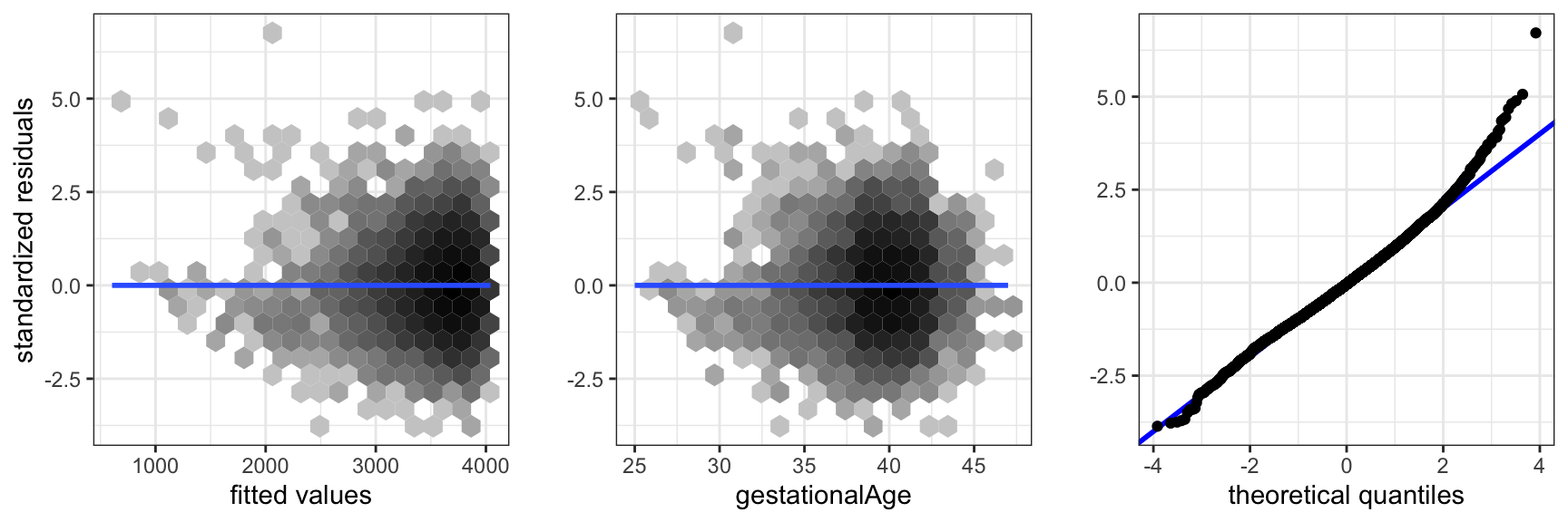
gestationalAge expanded using splines.
The positioning of the knots for spline expansion is selected based on the marginal distribution of the predictor1 The knots should be placed reasonably relative to the distribution of the predictor, so that we learn about nonlinearities where there is data to learn from. In this case we placed knots at the median and the 10% and 90% quantiles of the distribution of gestationalAge. The ns() function makes a similar automatic selection of knots based on the marginal distribution of the predictor variables when it is applied in the formula. One just have to specify the number of basis functions using the df argument.
1 Letting the knots be parameters to be estimated is not a statistically viable idea. The resulting estimation problem becomes computationally much more difficult, and it is not straightforward how to adjust subsequent statistical analyses to account for the data adaptive choice of knots.
An eye-ball decision based on Figure 3.8 would be that a single knot around 41 would have done the job, but we refrained from making such a decision. A subsequent test of the nonlinear effect with 1 degrees of freedom would not appropriately take into account how the placement of the knot was made.
Figure 3.12 shows diagnostic plots for the nonlinear main effects model. They show that the inclusion of the nonlinear effect removed the previously observed problem with assumption A1. The error distribution is still not normal, but right skewed with a fatter right tail than the normal distribution. There is a group of extreme residuals for preterm born children, which should be given more attention than they will be given here.
Reduced nonlinear main effects model.
Code
form <- weight ~ nsg(gestationalAge) + children + coffee + smoking
birth_weight_lm_spline_small <- lm(form, data = birth_weight)
anova(birth_weight_lm_spline_small, birth_weight_lm_spline) |>
knitr::kable()| Res.Df | RSS | Df | Sum of Sq | F | Pr(>F) |
|---|---|---|---|---|---|
| 11142 | 2469351552 | NA | NA | NA | NA |
| 11134 | 2466413420 | 8 | 2938131 | 1.657931 | 0.1032394 |
Table 3.9 shows that dropping the 4 weak predictors from the nonlinear main effects model is again borderline and not really significant.
Figure 3.13 shows examples of the fit for the reduced nonlinear main effects model. The figure illustrates the general nonlinear relation between weight and gestationalAge. Differences due to other variables are purely additive in this model, which amounts to translations up or down of the curve. The figure shows a couple of extreme cases; the majority group who have had children before and who don’t smoke or drink coffee, and a minority group who have had children before and smoke and drink coffee the most. What we should notice is the wider confidence band on the latter (smoke = 3, coffee = 3) compared to the former, which is explained by the skewness of the predictor distributions. Table 3.10 gives confidence intervals for the remaining parameters based on the nonlinear main effects model.
Code
pred_frame <- expand.grid(
  children = factor(1),
  smoking = factor(c(1, 3)),
  coffee = factor(c(1, 3)),
  gestationalAge = seq(25, 47, 0.1),
  alcohol = 0,
  age = median(birth_weight$age),
  feverEpisodes = 0,
  abortions = factor(0)
)

pred <- predict(
  birth_weight_lm_spline,
  newdata = pred_frame,
  interval = "confidence"
)

pred_frame <- cbind(pred_frame, pred)

ggplot(pred_frame, aes(gestationalAge, fit, color = coffee)) +
  geom_line() + ylab("weight") +
  geom_ribbon(
    aes(ymin = lwr, ymax = upr, fill = coffee),
    alpha = 0.3
  ) + facet_grid(. ~ smoking, label = label_both)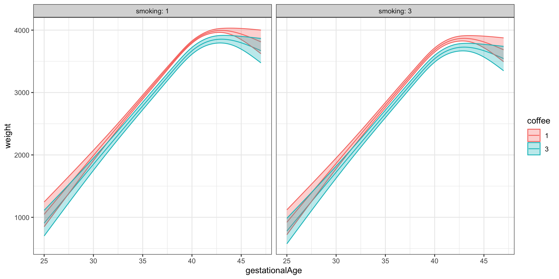
gestationalAge. Here illustrations of the fitted mean and 95% confidence bands for children=1.
| term | conf.low | conf.high |
|---|---|---|
| children1 | 155.470 | 194.087 |
| coffee2 | -82.608 | -42.431 |
| coffee3 | -193.020 | -87.630 |
| alcohol | -13.167 | 6.509 |
| smoking2 | -125.758 | -75.259 |
| smoking3 | -155.765 | -97.975 |
To conclude the analysis, we will again include interactions. However, the variable gestationalAge is in fact only taking the integer values 25 to 47, and the result of a nonlinear effect coupled with a third order interaction, say, results in an almost saturated model. That is, the interaction model has more or less a separate mean for all observed combinations of the predictors. We choose to consider a less complex model with all second order interactions between gestationalAge and the three factors that we have judged to be strong predictors.
Nonlinear interaction model.
Code
form <- weight ~ (smoking + coffee + children) * nsg(gestationalAge) +
   ns(age, df = 3) + alcohol + abortions + feverEpisodes
birth_weight_lm_spline_int <- lm(form, data = birth_weight)
Code
pred_frame <- expand.grid(
  children = factor(c(0, 1)),
  smoking = factor(c(1, 2, 3)),
  coffee = factor(c(1, 2, 3)),
  gestationalAge = 25:47,
  alcohol = 0,
  age = median(birth_weight$age),
  feverEpisodes = 0,
  abortions = factor(0)
)

pred <- predict(birth_weight_lm_spline_int, newdata = pred_frame, interval = "confidence")


pred_frame <- cbind(pred_frame, pred)
pred_frame$fit_spline <- predict(birth_weight_lm_spline, newdata = pred_frame)

ggplot(pred_frame, aes(gestationalAge, fit)) +
  geom_point(data = birth_weight, aes(y = weight), size = 0.3, alpha = 0.1) +
  facet_grid(coffee ~ children + smoking, label = label_both) +
  geom_ribbon(aes(ymin = lwr, ymax = upr), fill = gray(0.85)) +
  geom_line(color = "red") + coord_cartesian(ylim = c(0, 5000)) +
  geom_line(aes(y = fit_spline), color = "blue") + ylab("weight") +
  scale_y_continuous(breaks = c(1000, 2000, 3000, 4000))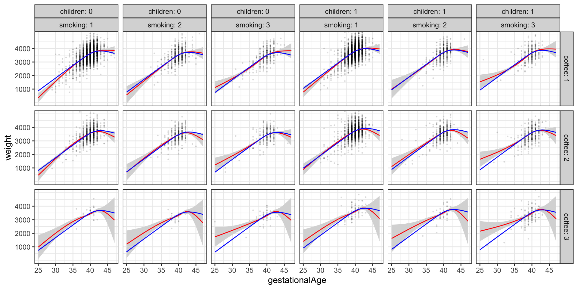
Figure 3.14 shows the predicted values for the reduced nonlinear main effects model for all combinations of children, smoking and coffee (blue curves). These curves are all just translations of each other. In addition, the figure shows the predicted values and a 95% confidence band as estimated with the nonlinear interaction model. We observe minor deviations for the reduced main effects model, which can explain the significance of the test, but the deviations appear unsystematic and mostly related to extreme values of gestationalAge. The conclusion is that even though the inclusion of interaction effects is significant, there is little to gain over the reduced nonlinear main effects model.
Code
anova(birth_weight_lm_spline, birth_weight_lm_spline_int) |>
knitr::kable(digits = 10)| Res.Df | RSS | Df | Sum of Sq | F | Pr(>F) |
|---|---|---|---|---|---|
| 11134 | 2466413420 | NA | NA | NA | NA |
| 11114 | 2451152208 | 20 | 15261213 | 3.459865 | 2.612e-07 |
Table 3.11 shows that inclusion of interaction terms is still significant by a formal statistical test. It is, however, always a good idea to visualize how the nonlinear interaction model differs from the model with only main effects as above instead of just focusing on the formal test. The test may, on the other hand, support the visualization as a quantification of whether the differences seen in a figure are actually statistically significant.
Exercises
Exercise 3.1 This exercise is on the modeling of annual wage. The data set wage from the R package RwR is from a US survey with 1125 respondents. It contains five variables. The response variable is wage, which is the respondent’s annual wage is USD. In addition to wage the dataset includes the variables: hours (annual hours worked), educ (education, 1 = no high school diploma, 2 = high school graduate, 3 = college graduate), age (age of respondent in years) and children (number of children living with the respondent). The respondents with hours and wage equal to \(0\) are unemployed.
The objective of this exercise is to fit a predictive regression model of wage using some or all of the other variables in the dataset.
There are few respondents with many children, and it might therefore be a good idea to collapse respondents with three or more children, say, into one group.
Fit and report a linear, additive model of the mean wage given some of the other variables using data for the employed respondents only.
Investigate how well the linear, additive model fits the data.
Investigate if nonlinear or interaction effects should be included into the model. Choose a model to report.
Use the model chosen to predict the wage distribution for the unemployed respondents should they get a job. Compare with the wage distribution for the employed respondents. Discuss reasons that would invalidate such wage predictions for the unemployed.